Dia.
An app to empower women in their fertility journey.
Published in 2022
Recognitions

Award
iF Design
Gold Award
German Design

Award
Good Design

Gold Award
European Design

Award
Red Dot
Strategy
User Research
Project Management
Brand Design
Interface Design
Interaction Design
User Testing
Design System
Illustration
Multimedia Design
Front-end Development
Back-end Development
Services
iOS App
Android App
CMS
Brand Identity
Deliverables
Team involved
Dia was created for TFP (The Fertility Partnership), one of Europe's most renowned fertility organisations, to empower women with knowledge and data beyond their period.
This connection between Significa, Dia, and TFP allowed us to provide a full-circle experience to the users. Education, health logs, habits tracking, and a fertility forecast, all combined, would enable women to own their body data.
Dia is our first project to win a Red Dot Design Award.
Dia has been thought of as more than just a period tracker. Which is what most competing Apps are used for. Dia aimed higher. It aspired to become a companion App, a lifestyle tracker, and a deeper insight into female health topics.

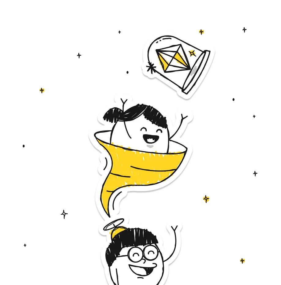
Dia is an app for modern women – guided by the belief that women deserve better-designed, technological healthcare.
Women shouldn't have to put up with non-nuanced, under-researched healthcare. Their wellness and fertility pose unique journeys and challenges. Dia aimed to fill gaps in knowledge, unify a fragmented journey and give women tools to take control of their bodies.

Dia aspired high. It aimed to acknowledge women profoundly on such a personal topic (fertility). It sought to be used daily because the more data collected, the more accurate the insights would be. It aimed to empower women with knowledge about their bodies, cycles, fertility, and calendars. With all this, emotion was our sought-after outcome.
Using Dia had to be unique. Special. A carefully chosen colour palette, punny illustrations, and a welcoming tone go along with the crucial role of micro-animations when getting users engaged.

An App women are keen to use, eager to experiment with, and enthusiastic about. In a trendy sentence: Emotional UX.
The Daily Tracker.
It was the subject of deep user research. As the core section of Dia, the tracker had to be engaging, intuitive and effortless to use.

The overall feel should be catching, dynamic, smart and engaging, and the interaction with the different cards should be incredibly easy, smooth and practical.
All interactions (big or small) were carefully studied and designed to provide an unforgettable personal experience, engaging with each user easily, smoothly, and practically.

We are a Red Dot-winner agency
We won a Red Dot with this Product and we wrote an article about it.
Data Visualization.
The sheer amount of data Dia feeds to the user is hard to grasp. There is a monthly view, a cycle view, and a breakdown of each individual cycle —with all the data inputs in.

With all the interactions possible, there's a bit of discoverability to it. However, once you get it, this data is invaluable.

“Significa supported us through the whole journey. From branding and setting the tone to the execution and the launch of a product that set a new standard for women's health apps.”
Chakameh Shafii
Former Director at TFP, Head of Dia
Feeding back information.
Regularly delivering new, tailored content is vital to keeping users bound to Dia. Dia takes all the user-input information and feeds back tailored content—articles, quizzes, and alerts—based on what they are going through. Research shows us these types of content are responsible for a large portion of user conversion, keeping curiosity and learning up to date.

Consistent. With a Design System.
As we all know, creating a design system is halfway to getting it done. Creating a beautiful design system is how we get it done. Consistency is the only way that makes sense for us to design and develop a product.

What are you looking for?
Please choose an option below
