16 May 2025
•
9 min read
What is a Design System? Real benefits and challenges.
Design systems bridge the gap between design and engineering. They help teams move faster, stay aligned, and build consistently, without compromising quality as products grow.

In this article, we’ll unpack what design systems are, explore both their advantages and their broken promises, and share how we approach them at Significa. Our perspective comes from over a decade of experience designing and building digital products with a designer’s eye, a developer’s pragmatism, and just enough playfulness to keep us from taking ourselves too seriously.
Systems shape how we organise knowledge and build the world around us, and design, whether of physical objects or digital products, is no exception. Think of the Bauhaus movement, a fusion of craftsmanship, art, and industry where the idea of a unified, functional aesthetic first took shape. Or Dieter Rams’ Ten Principles for Good Design placed clarity, functionality, and minimalism above all else. Rams’ belief that good design is as little as possible aligns closely with how we think about design systems today: fewer decisions are made better. Less friction, more flow. A shared structure that helps teams move faster without cutting corners.

Brands like IBM, NASA, and Apple have used design systems for decades in the form of detailed brand manuals and industrial design standards. Their digital counterparts emerged more visibly in the early 2010s, with systems like Google’s Material Design and Salesforce’s Lightning Design System leading the charge. Today, most SaaS companies maintain robust online systems that are treated as products themselves. IBM, for example, has evolved from Paul Rand’s print-based brand book in the 1960s to the Carbon Design System, one of the most comprehensive and well-maintained design systems in the industry.


Notable Design Systems have one thing in common: a carefully constructed, continuously maintained system that helps their teams stay aligned while moving fast.
So, what is a design system?
Think of it as a Lego set for your product: clearly defined bricks, consistent colours, and shared instructions for how everything fits together. At Significa, we break it down into Tokens, Primitives, and Components, but instead of toys, we’re building platforms, tools, and apps people rely on every day.
The pillars of a Design System
Tokens: the foundation of a design system, standardising elements like colour, typography, spacing, and radius to keep design and development aligned. They ensure consistency at scale and make updates easy by centralising changes.
Primitives: styled, reusable UI elements like
<button>,<input>or<label>that form the backbone of any interface. They’re purely presentational, built to be flexible, composable, and as close to native markup as possible, with minimal logic and maximum reusability.Components: reusable building blocks like cards, forms, modals, created by combining primitives into more complex patterns. They help reduce repetition and improve maintainability, speeding up development. Some components may be intentionally opinionated, prioritising simplicity and ease of use over flexibility.
Still, a design system is often misunderstood. It’s not just a Figma file or a component library, though it may include both. It’s a shared foundation that brings design and engineering together. It combines visual styles, UI components, usage guidelines, documentation, accessibility standards, and development-ready code into a cohesive, scalable structure. It helps teams stay aligned, move faster, and make better decisions because those decisions are no longer made in isolation.
We mention Figma because, let’s be honest, it’s become the industry standard for a reason. While tools like Sketch and Adobe XD have their place, Figma continues to lead, especially with recent launches like Dev Mode and Variables, which are changing how we think about theming and component logic.
But tools alone aren’t enough. A design system is shaped by the people who use it, maintain it, and evolve it over time. That’s why our approach at Significa puts co-creation at the centre. We believe a design system isn’t something delivered at the end of a project; it’s built in collaboration with our clients, shaped by real-world needs, and designed to flex as the product grows. That means involving both internal and external stakeholders early and building a system that reflects how teams work.

Collaboration is essential to any design system… but without structure, it quickly becomes messy. Governance is what holds things together. It’s not about gatekeeping, but about defining roles, setting contribution rules, and ensuring the system grows in the right direction. At Significa, we take on that stewardship. We maintain the integrity of the system while still creating space for others to contribute meaningfully.
And because no system stands still: products evolve, teams grow, or new priorities emerge, every piece of the puzzle needs to keep up. That’s why we pay attention to how components are used, where friction starts to build, and which patterns no longer serve their purpose. Refining the system is just as important as building it in the first place. Done well, it becomes more than a set of rules: it becomes a tool for pushing the product forward.

Shared language, shared outcomes.
A design system brings teams together by giving them a shared language. When everyone’s working from the same foundations, there’s less back and forth, fewer misunderstandings, and a lot less wasted effort. Handoffs become cleaner because expectations are already aligned. When we say “button,” it means the same thing in Figma as it does in code, and that clarity is where real speed starts to happen.
At Significa, we don’t build full libraries upfront. We start with what’s essential, then expand as real needs emerge. Components are tested in production. Tokens aren’t just visual, they’re implemented in code from day one. By standardising the basics, we reduce decision fatigue and give teams space to focus on what matters: the product experience itself.
Accessibility through and through.
This close collaboration between design and development helps ensure accessibility isn’t something tackled at the end. It’s part of how we build from the ground up. By embedding inclusive practices at the design system level, we ensure that usability for a broad range of needs is considered from day one. From contrast ratios and font sizing to semantic HTML and focus management, we design for real-world conditions, not ideal scenarios.
Tokens define contrast and scale. Primitives support keyboard navigation. Components are developed with semantic structure and ARIA roles in mind. Details like legibility, motion preferences, and focus behaviour are factored in early and consistently, because that’s how people use digital products.
A good system also distributes responsibility. With thoughtful defaults and clear documentation, accessibility becomes a natural part of the workflow. It’s something everyone contributes to by design (see what we did there?).
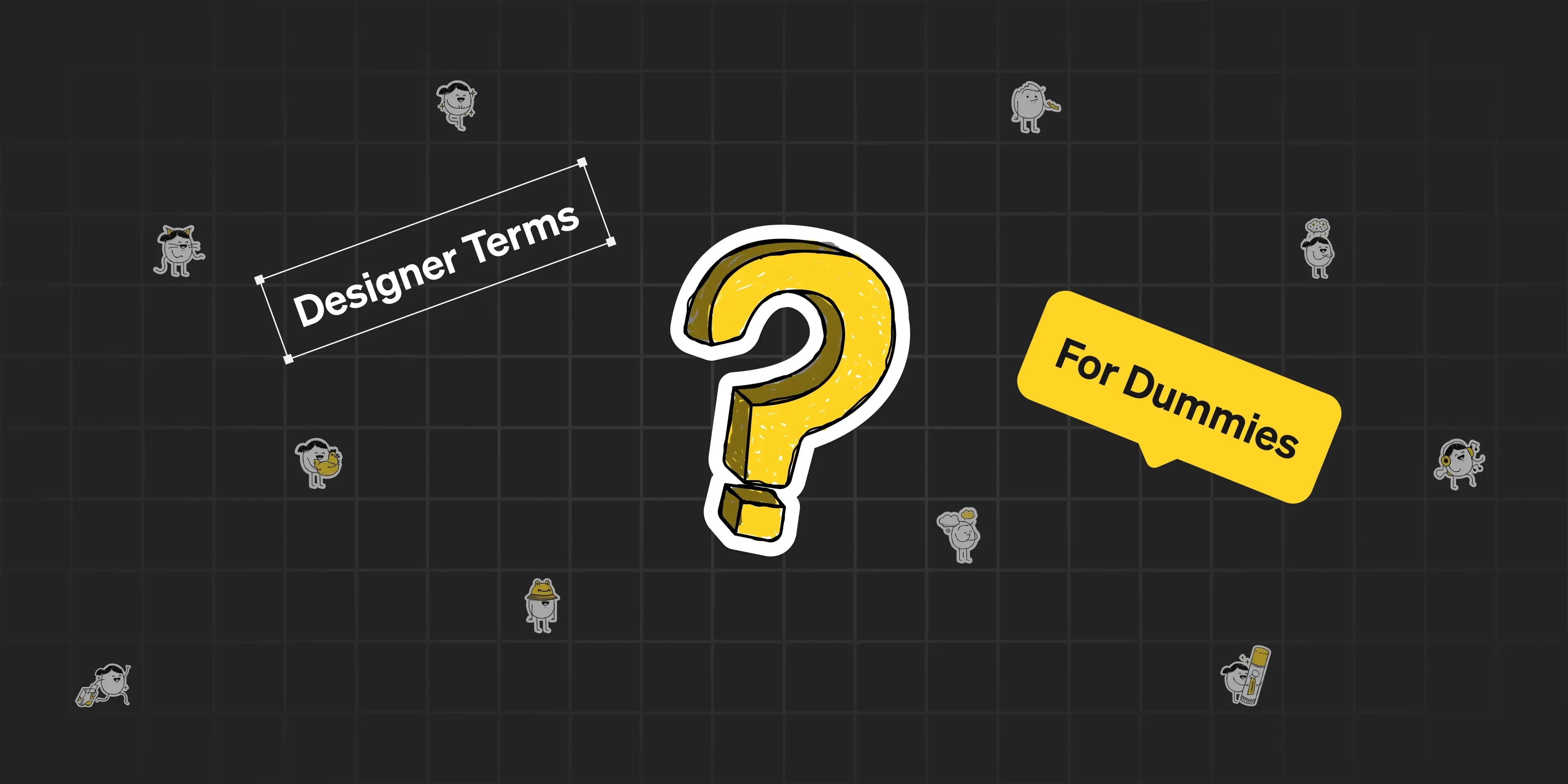
Designer terms for Dummies
This glossary will help you understand what terms like UI/UX, responsive, auto-layout and others actually mean.
Design debt(less).
Design debt builds up quietly. Development slows down, quality slips, and you end up fixing the same issue three different ways, three different times.
A well-built design system helps prevent that. It creates alignment without the need for constant meetings. It speeds up delivery without compromising quality. And it frees your team to focus on solving real problems, not just re-styling buttons. Even big changes, like a rebrand, become simpler when “all” you need to do is update the system’s foundations.
But design debt isn’t just technical. It’s creative too. Inconsistent UI patterns, conflicting interpretations of brand elements, or disconnected motion behaviours gradually weaken a product’s integrity. Without a shared system, designers are forced to repeat the same decisions in isolation, often without the full picture. That leads to fatigue, inefficiency, and ultimately a fragmented user experience.
To avoid that, a design system needs more than visual polish. It has to reflect how your team works and how your product is expected to grow. It should evolve with intention and be maintained with care. That kind of investment pays off — not only in performance, but in clarity, cohesion, and creative focus.

A/B testing.
The flexibility of design systems makes A/B testing far more efficient. Because elements are modular and standardised at the code level, designers can quickly explore variations without the need to create entirely new templates or assets from scratch.
Teams can test different layout patterns, visual treatments, or interaction behaviours, then gather performance data and implement changes with confidence. This way of working speeds up iteration cycles and helps businesses refine their interfaces based on real user feedback.
Tools like Figma Variables have made this process even smoother by allowing designers to switch between themes, devices/products components within a single file, and experimenting within the system has never been easier.
Speaking of A/B testing
When we first launched the newest version of Hey Harper, we tested it against the old one. Guess what happened…
The broken promises of design systems.
Now let’s look at it from another angle, because every good system has its bright side and its dark corners. In his 2024 Config talk, Cameron Worboys, Head of Design OS at Cash App, challenged the idea that design systems always deliver on their promise. He points to three big ones: speed, cohesion, and quality. And asks: Are we getting any of them?
Speed, for example, is often cited as a major benefit. But in an internal experiment at Cash App, redesigning a screen outside the system took longer, but led to a better result. This raises an important point: creativity doesn’t always start with constraints. Designers need the freedom to explore before translating their ideas into system rules. At Significa, we see the design system as a guide, not a gatekeeper. The goal is to support great work, not restrict it.
Worboys also warned against over-standardisation. When everything looks and behaves the same, brand identity can begin to blur. Instead of consistency, the result is sameness. That’s why we build systems to be cohesive, not rigid. There should always be room for voice, personality, and context—whether through type, motion, layout, or micro-interactions. The system should serve the brand, not flatten it.
As Worboys put it, “Great ideas never start with a system.” But with the right structure in place, a great idea can be translated, shared, and scaled, without losing its soul.

Get the full scope of Worboy’s insights!
Leveraging his experiences at Wise, Beats, and Cash App, he shares examples, advice, and stories on creating world-class design systems.
No secret recipes!
Cameron Worboys made a great point at Config: design systems are like recipes. Not because they guarantee consistent results, but because even with the right ingredients and a set of guidelines, it still takes experience, experimentation, and a bit of creative instinct to get it right.
There’s no single way to build a design system. What works for one team might fall apart for another. The structure matters, but so does how it’s used. A system can guide decisions, but it can’t replace thinking. It can streamline work, but it can’t automate taste.

How to choose the right Design System?
Choosing the right design system helps startups build consistent, scalable, and trustworthy products that users, investors, and partners believe in.
At Significa, we’ve learned that the most resilient systems are the ones built through use: tested in the wild, tweaked over time, and refined by the people who rely on them daily. They don’t just enforce consistency. They create space for clarity, alignment, and better work across the board.
And if nothing else, a good system makes sure no one ever has to ask, “Which blue are we using again?”

Further reading
A design system should work for everyone, not just most people. If you want to make your components more inclusive, here’s a practical look at designing interfaces that support colourblind users.
André Furtado
Creative Director
André is the CDO at Significa. As an artistic mind, his thinking is constantly roaming around, wandering the never before sailed oceans of the Azorian shore. Usually away from his phone, his wallet, or his watch, which he’s lost somewhere.
We build and launch functional digital products.
Related articles
André Furtado
Creative Director
27 May 2026
•
5 min read
Teresa Araújo
Designer