27 May 2026
•
5 min read
What happens before Design? Wireframes and look & feel, explained.
Design covers a lot of ground, and not all of it produces something immediately legible to someone outside the process or the industry.
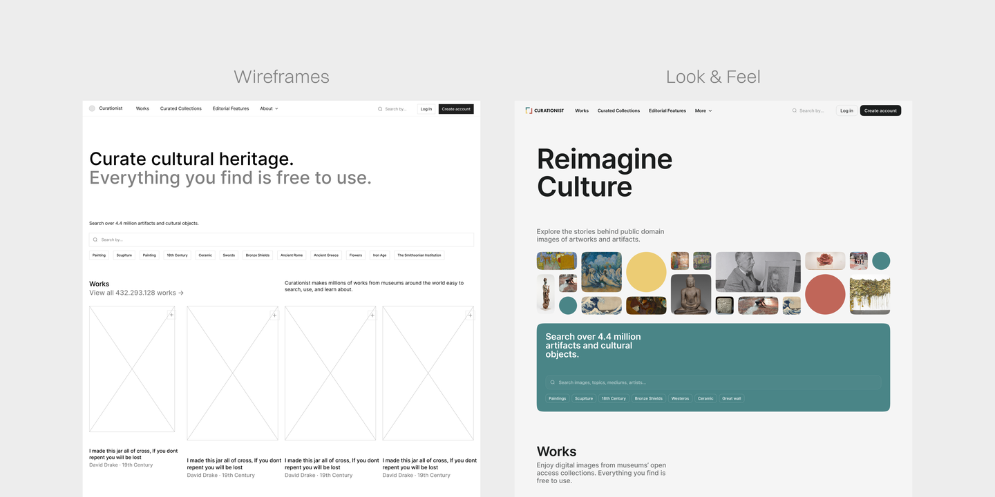
Every client reaches a point in a project where they want to understand what they will actually be looking at. It's a reasonable thing to want. Wireframes and Look & Feel sit at the beginning of our process, which is also why they're two of the phases clients find hardest to evaluate and whose value is hardest to grasp. Understanding what each one is for, and why the order between them matters, tends to make the whole thing considerably easier to navigate.
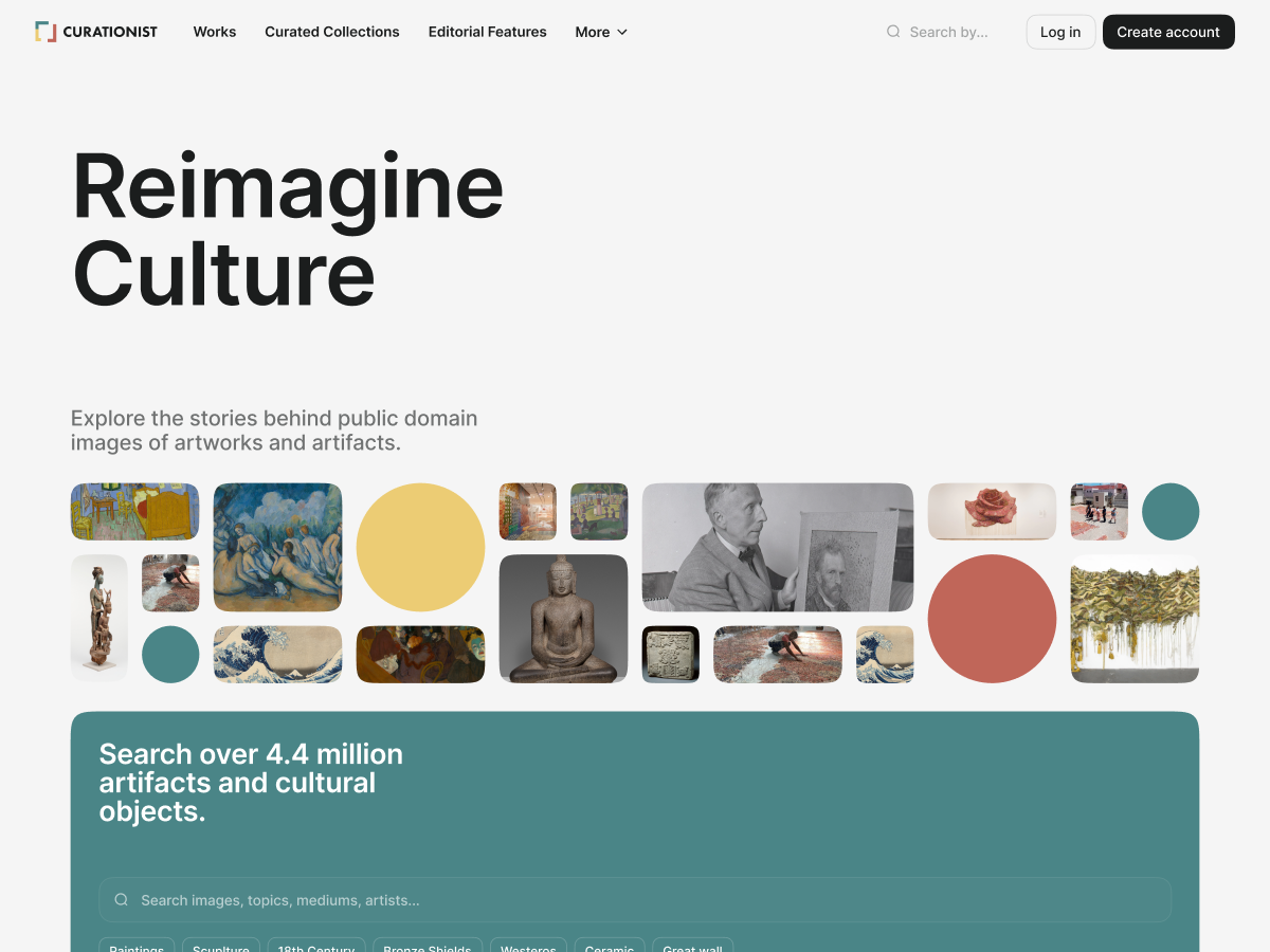
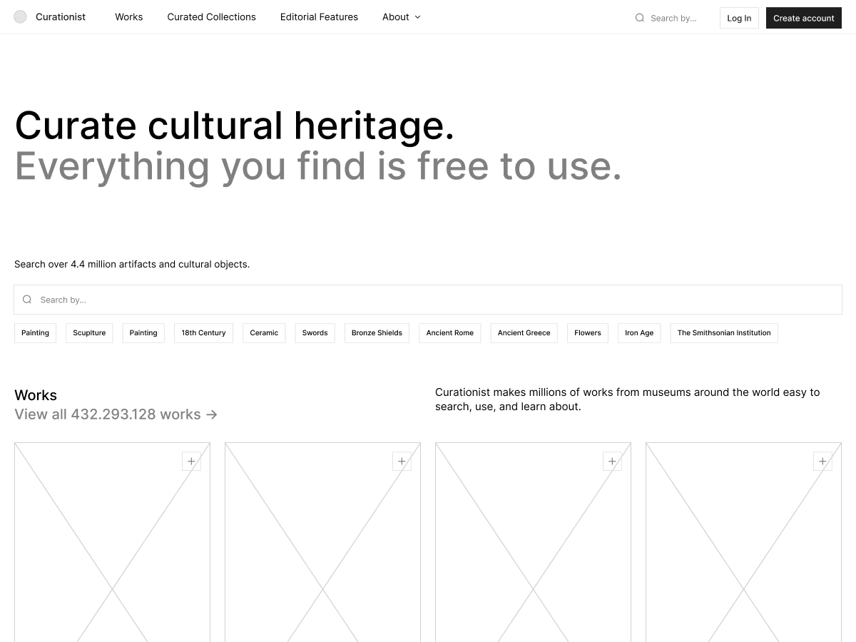
Function before form: wireframes.
A wireframe maps the architecture of a digital product before any visual decisions are made. It defines where things live on a page, how they relate to each other, what is interactive and what isn't, and how a user moves from one point to the next, all without colour, typography, or any visual identity in sight.
When a digital product is stripped to its bare bones, every usability decision has to justify itself on functional grounds. Is the content hierarchy serving the user or confusing them? Does a certain flow make sense? These are questions that get much harder to answer honestly once something starts looking good, because a well-executed visual can make a poorly thought-out structure feel more coherent than it actually is.
For clients, wireframes represent the earliest point in a project where they can meaningfully evaluate whether what's being built is actually what they and their users need. Feedback at this stage tends to be sharper and more useful, precisely because there's less to react to emotionally. At this point, a change to a layout or a user flow costs a fraction of what it would once development begins.
“Two products can share the exact same wireframe and end up feeling completely different once look & feel is applied, which means reviewing the structure in isolation, before personality enters the picture, is one of the more honest conversations you can have about a product.”
Rita Robalinho
Designer
Wireframes also bring designers and developers together to align early, and that alignment has real benefits. Julieta, one of our frontend developers, is direct about what happens without them: core product ideas that turn out to be technically unfeasible within current budget or timeline don't surface until after a months into a project, by which point significant work has been built on top of an assumption nobody tested. André, another front-end developer at Significa, adds that wireframes are the clearest way to get a holistic view of the product before any code is written, precisely because a structural decision that looks reasonable on paper can carry hidden technical complexity underneath. A wireframe is where those specifics get caught, while it's still cheap to re-think them through.
Designer terms for Dummies.
If “Wireframes” and “Look and Feel” are just the tip of the iceberg of design terms you don’t understand, go ahead and…
AI has also changed what's possible at the wireframing stage; we can now produce clickable, navigable prototypes considerably faster than before, which means clients can experience a flow early on instead of having to reconstruct it mentally from a static document. Because those prototypes can be rebuilt and versioned quickly, user testing no longer has to be the first thing cut when a timeline gets tight. We can test genuinely different approaches without putting the schedule at risk, which means experimentation becomes part of how we work.
Form follows: look & feel.
Once the structure is solid, the visual language can follow. Look & feel is the phase where typography, colour, texture, imagery, motion and transitions are introduced, and where the product starts to communicate something beyond its function. People form impressions of digital products quickly and largely unconsciously, and those impressions are shaped by decisions that are easier to underestimate than you might expect: a colour palette shapes how users perceive a brand's personality long before they've read a word of copy, typography affects legibility and hierarchy simultaneously, and motion communicates how a product behaves at a level users register without consciously noticing. This is the phase where all of that gets defined.
“The same structure can read as serious and professional or warm and playful depending entirely on the visual decisions layered on top of it, which is why those decisions deserve the same rigour as the structural ones that came before them.”
Teresa Araújo
Designer
The look & feel phase also changes what's possible on the development side. Once the visual direction is established, engineers don't have to wait for the full design to be finalised before starting to build. Tokens can be configured, base components like buttons and input fields can be assembled, and on marketing sites the grid and page layout can begin taking shape, meaning design and development move forward together rather than in sequence.
“Through look & feel we can already start making tokens and building basic components. We don't have to wait.”
André Santos
Front-end Developer
It's also the phase where certain problems surface before they become expensive. What works well in Figma doesn't always translate cleanly to the browser. André remembers a project where a typographic treatment with progressive blurs looked strong in the designs but wasn't something the web could support well. Catching it at the look & feel stage meant it never reached the client, and the team could find an alternative without disrupting anything downstream.
One thing worth clarifying, particularly for clients going through this process for the first time, is that look & feel is a direction, not a finished design. At this stage, we're establishing the visual language that will inform every decision that shapes the Design System and its components, not signing off page by page from the homepage down. Feedback rounds are more productive when that's understood, because they focus on whether the direction feels right rather than on details that don't exist yet.
What is a Design System?
A shared structure that helps teams move faster without cutting corners.
André Furtado
Creative Director
André is the CDO at Significa. As an artistic mind, his thinking is constantly roaming around, wandering the never before sailed oceans of the Azorian shore. Usually away from his phone, his wallet, or his watch, which he’s lost somewhere.
We build and launch functional digital products.
Related articles
Rui Sereno
CEO
Rui Sereno
CEO
10 August 2026
•
4 min read