22 Jan 2026
•
6 min read
Designing complex products through client collaboration.
I recently designed an insurance management product. My knowledge of insurance? Zero.

I could barely tell you the difference between premiums and brokers, let alone design a platform that finance professionals would use daily to reconcile thousands of payments. But here's the thing: designers rarely start projects as domain experts, and we don't need to be. What matters is working closely with those who are. The real skill isn't becoming an insurance expert overnight, but knowing how to collaborate effectively so you can translate complex industry logic into something intuitive.
This project taught me that designing for unfamiliar industries is all about structured collaboration, asking the right questions, and building understanding together with the client.

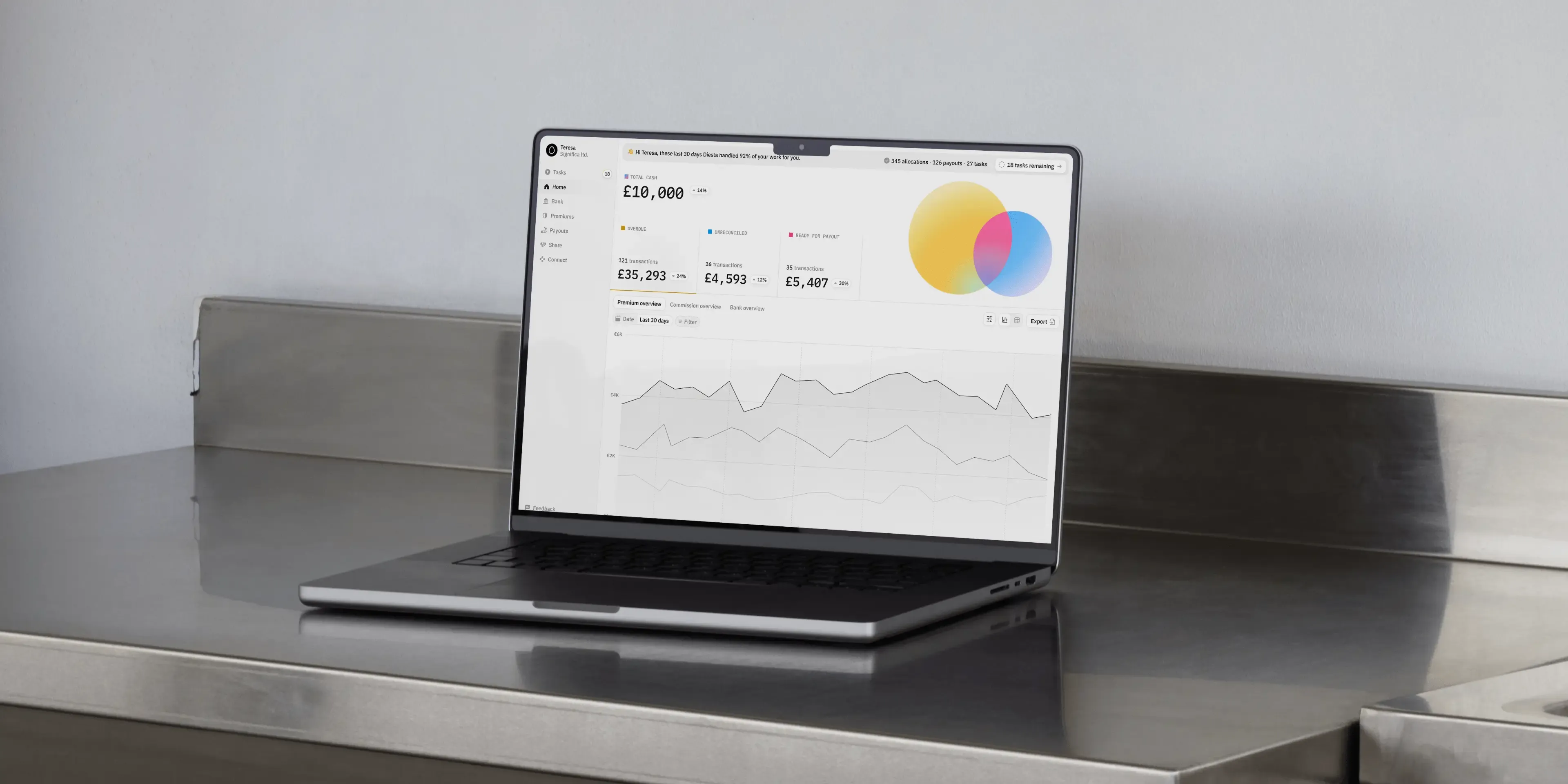
Streamlining insurance payments
Before you uncover all the insights from this article, discover the project behind it.
Collaboration is non-negotiable.
Clients know regulations, edge cases, and all the tiny details you'd never think of. But that deep knowledge also creates blind spots. What feels obvious to someone who's been in insurance for fifteen years might be completely baffling to a first-time user. In fact, our clients may know what needs to happen in their products, but they don't always see where the friction points lie.
That's where we come in, translating complex business logic into intuitive interfaces. But we can't succeed in any of it alone. In this case, we needed Chris', Julian's and Nabil’s expertise as much as they needed our fresh perspective.
Start with structured knowledge extraction.
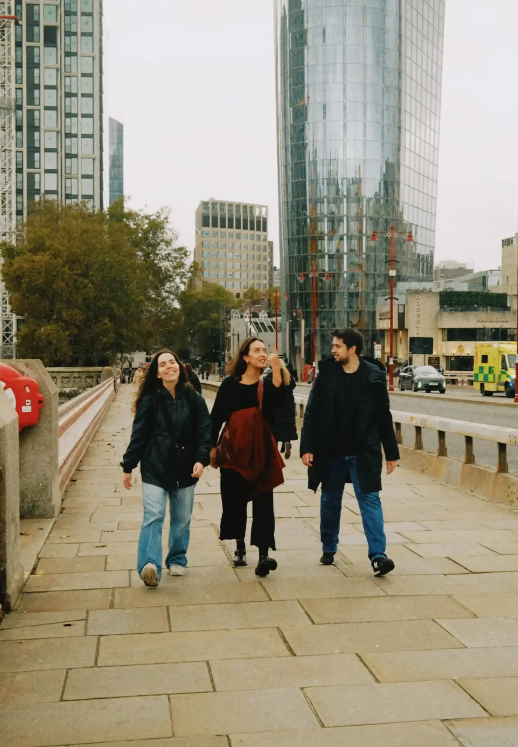
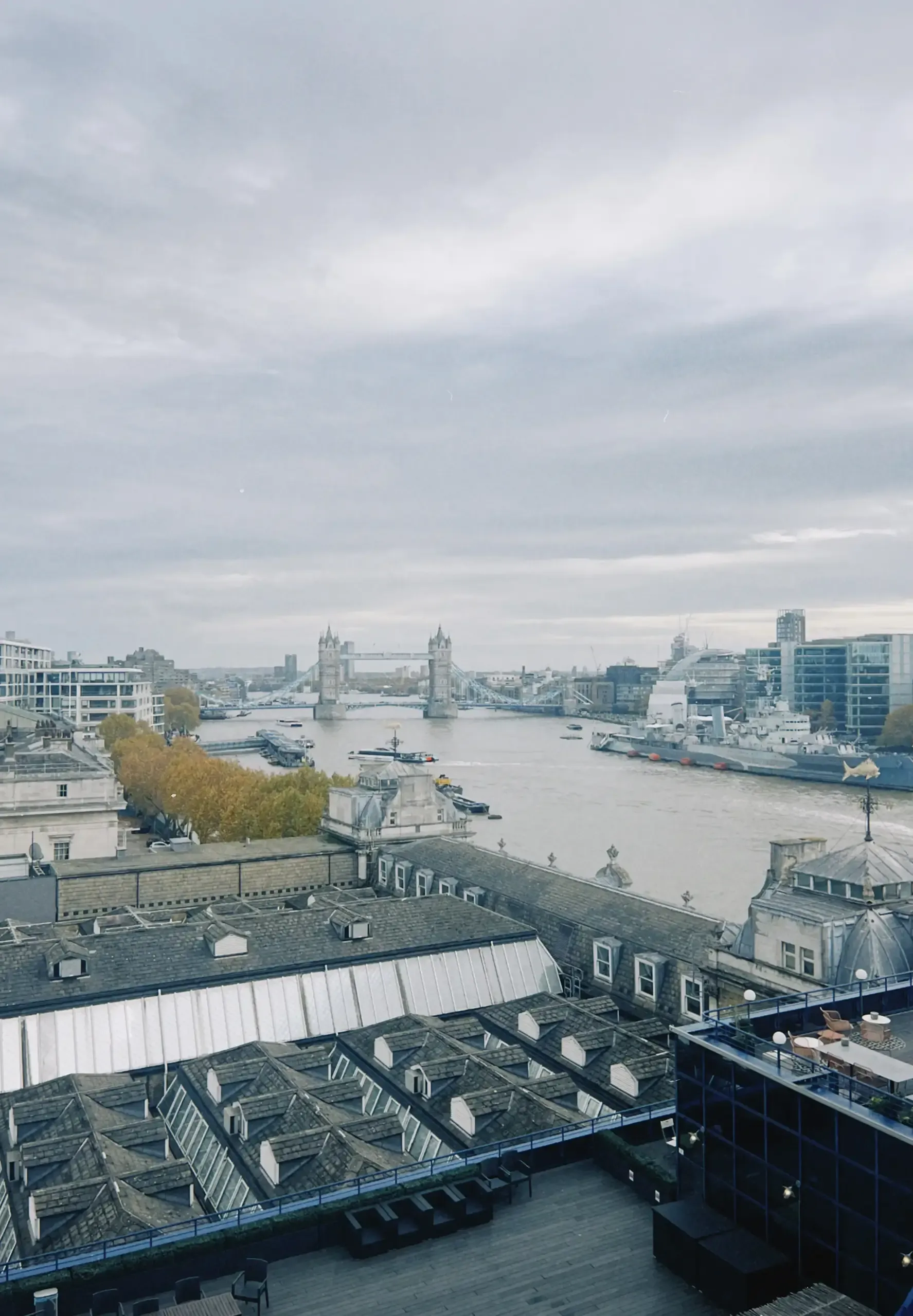
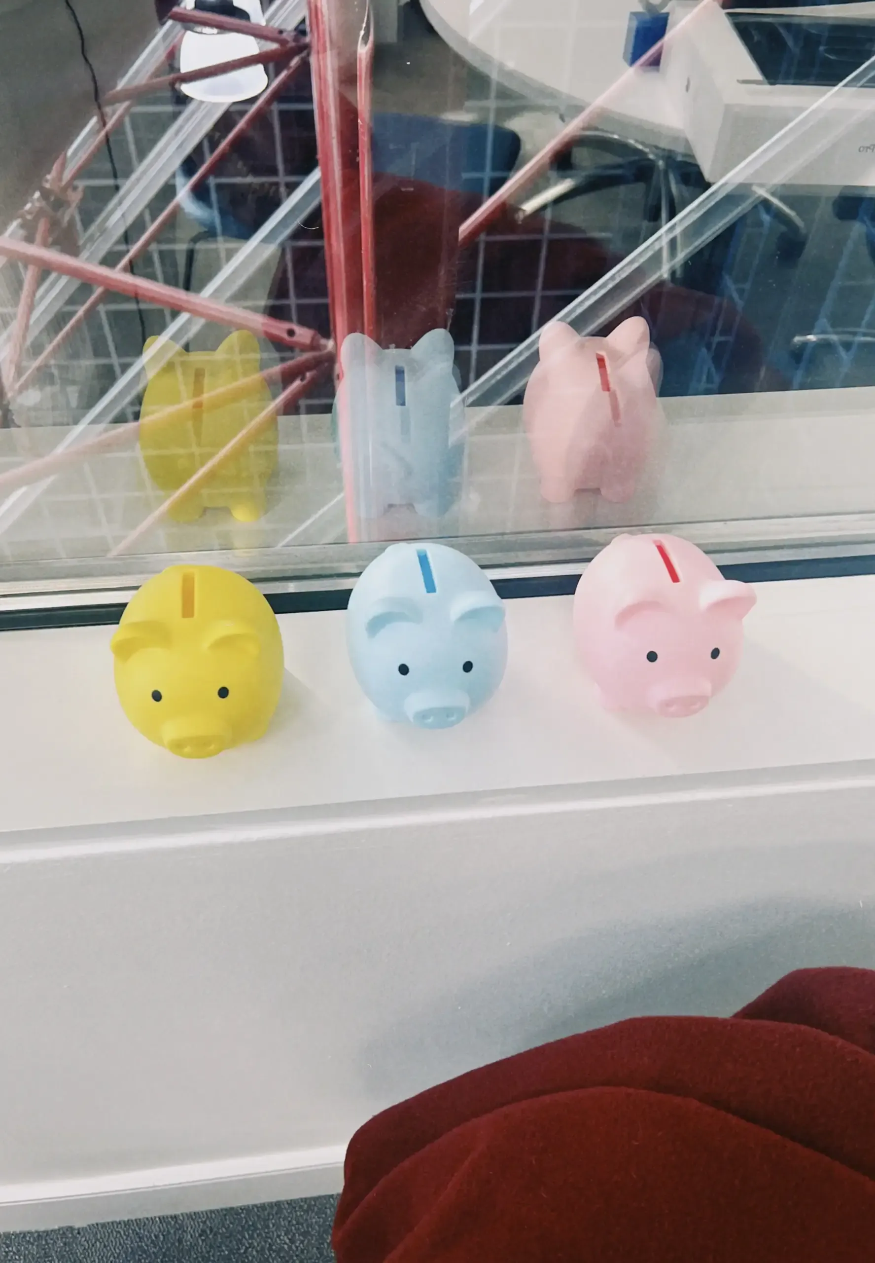
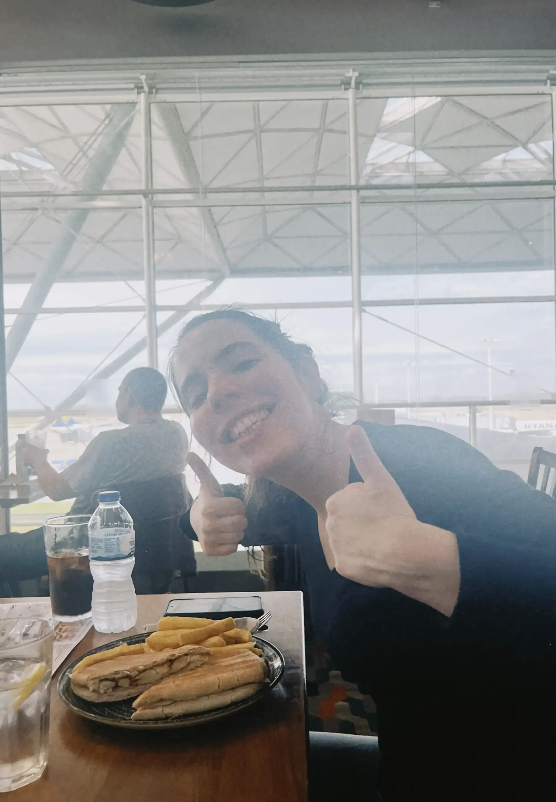
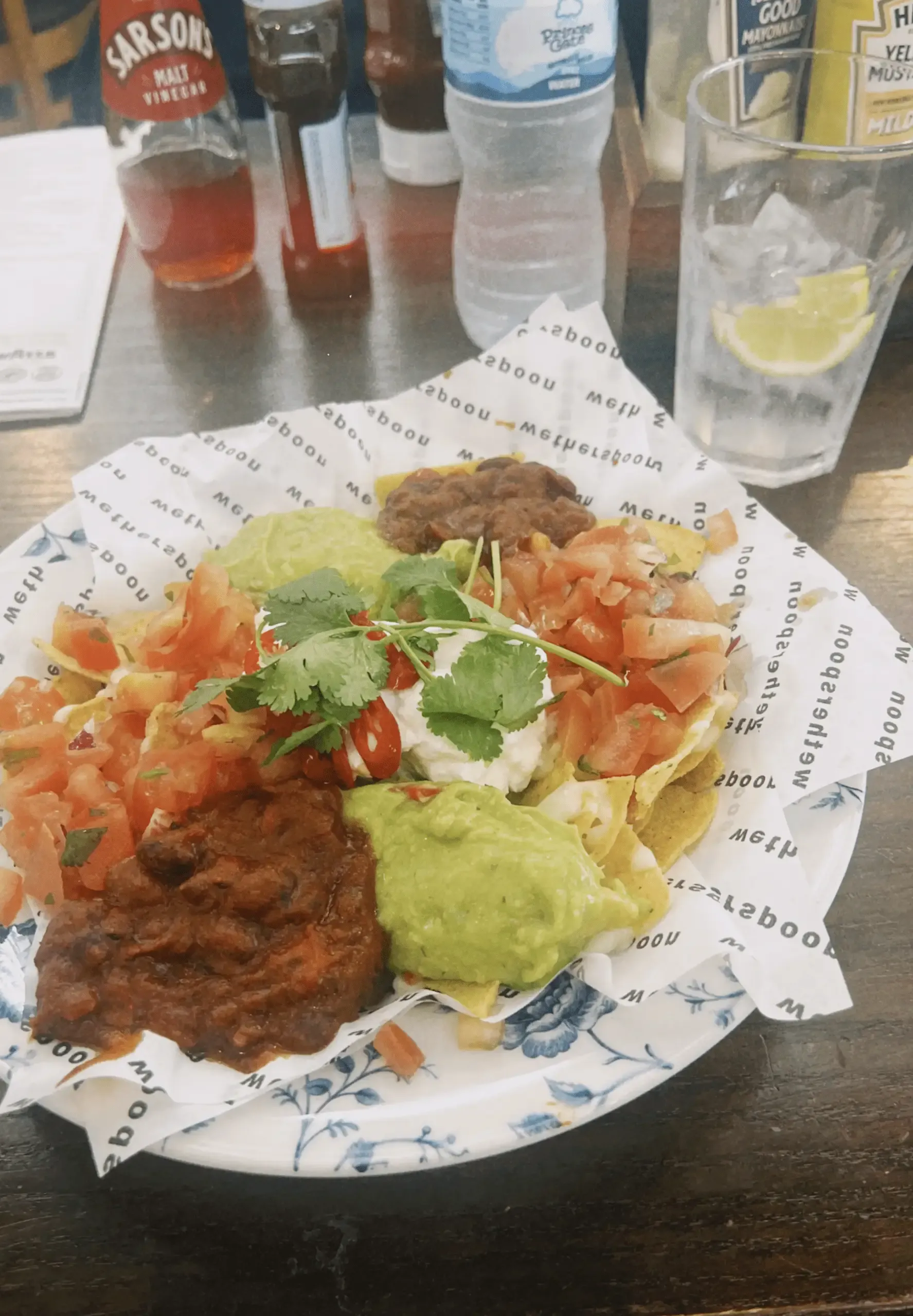
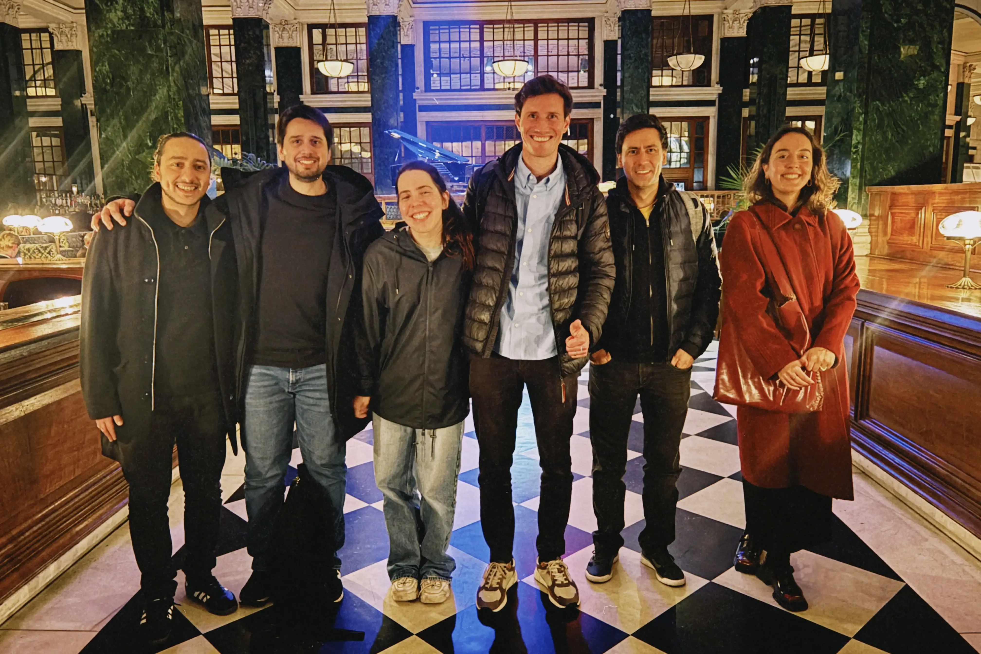
We could have spent weeks buried in research, trying to decode insurance payments by ourselves. Instead, we kicked things off with a no-such-thing-as-silly-questions workshop in which Diesta’s team walked us through their existing processes, step by step. We mapped out workflows on whiteboards, identified where things broke down, and spotted inefficiencies they'd stopped noticing because they'd been living with them for so long. As the product evolves, we continue to run these workshops, the last of which took place in their offices in London. I could add some photos of the workshop itself below, but here are some snippets of our trip instead. My favourite is the one where you can see 3 piggies they got in Diesta’s colours.
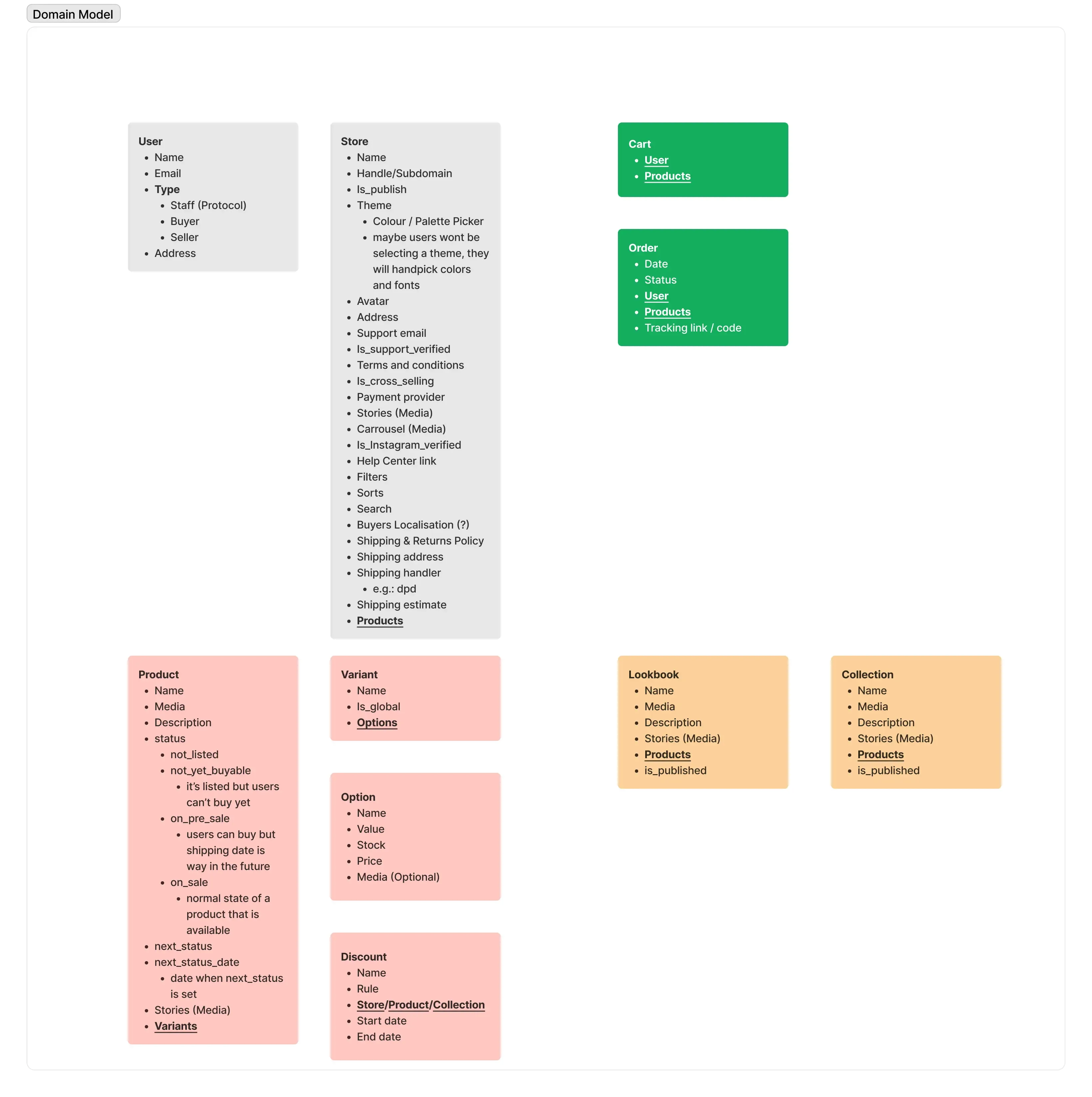
Domain models.
One thing I'd do differently next time? Create a domain model right from the start. For this project we didn't do one, and we managed to align eventually, but it cost us time and caused early confusion that could have been avoided.
A domain model is basically a map of the industry's key concepts and how they relate to each other. In this project, terms like premiums, lines of business, and payouts had very specific meanings to Chris and Julian. To us, they were just abstract finance words that all sounded vaguely similar. A clear Domain Model would have given us a shared reference point from day one. And it doesn't even need to be super elaborate! A simple diagram showing what connects to what, what depends on what, and what the key terminology actually means would have saved us from spending the first few weeks slightly lost in translation.
If you're starting a project in an unfamiliar industry, build this early, I promise it's worth the upfront effort.
Designing for any industry
The patterns, boundaries, and mindset that make unfamiliar domains manageable.
Keep feedback continuous.
One trap I've fallen into before is treating design like a linear process with a grand reveal at the end. You disappear into your own bubble, obsess over every detail, convince yourself that if you just refine it a bit more, it'll be perfect. When you finally present your masterpiece, you realise you’ve just spent weeks perfecting details that weren't actually that important yet.
I avoided this by bringing the client into the process from the start. Rather than presenting finished screens, we worked together. We sketched ideas, mapped out workflows, tested assumptions early when they were still relatively easy to change. This approach took a huge weight off my shoulders because I wasn't carrying all the decisions alone.
We kept feedback continuous and lightweight with quick check-ins, async comments on Figma, or Loom videos explaining flows when something needed more context. No one waited around for weeks for a big reveal. This meant faster decisions, fewer revisions, and far less "wait, that's not what we meant" moments later on.
Julieta, our frontend developer working full-time with Diesta, experienced this collaborative foundation firsthand during implementation:
“From the outside, it might not seem like the most exciting area, but I was genuinely surprised by how intricate and intellectually stimulating it is. Insurance payments involve a huge amount of nuance, edge cases, and interconnected rules, which means there's never a boring day. The deeper you go, the more layers you uncover. There's always something new to learn about the industry, and that constant discovery makes the work surprisingly engaging.”
Julieta Frade
Front-end developer
That complexity is exactly why continuous collaboration matters. When requirements shift mid-implementation (as they inevitably do), having that shared understanding means changes don't undermine the design intent. But collaboration alone wasn't enough. We still needed ways to make the complexity feel manageable.
Bridging analogies.
One of the most effective ways I found to cut through complexity was using analogies: connecting unfamiliar processes to concepts everyone understands. In this project, we approached an insurance payout processing flow like an e-commerce checkout.
It sounded odd at first, but when you break it down, the parallel actually holds:
Choose what to "buy" → Select which premiums or payment slices to process;
Review your cart → Double-check your payout selections, make sure everything's correct;
Complete the checkout → Process the payout;
By framing it this way, we demystified what could have been a labyrinth of confusing insurance jargon. It helped us get on the same page with Diesta faster, and more importantly, it gave us a familiar structure to design around. Users might not know insurance reconciliation, but they definitely know how to check out online.
This is part of the designer's job: making the complex feel natural by using patterns people already recognise. Even when insurance payouts and e-commerce checkouts couldn't be more different on the surface, the underlying user journey is surprisingly similar.
Clients aren't their users.
No matter how much Diesta knew about insurance, there was one thing they couldn't tell us with certainty: how actual users would interact with the platform. Client knowledge doesn't equal user behaviour, and that's a crucial distinction.
This is why user testing isn't just a nice-to-have at the end of a project. Ideally, it should be woven into the process from the start. We built a strong foundation by working closely with Diesta, but the real test comes when finance professionals who've never seen the platform before try to use it for the first time.
Julieta's been invaluable here too. Working with Diesta day-to-day, she spots friction points we might have missed in static designs where the real-world complexity of insurance reconciliation bumps up against what we thought would work.
As the product evolves, we continue to test key flows, track where people get stuck, and validate that what made sense in workshops actually works in practice. Because at the end of the day, we're not designing for Chris, Julian or Nabil. We're designing for the people in insurance companies and brokerages who need to reconcile payments quickly and accurately, often under pressure.
Build with clients AND validate with users. Both are essential!
Lessons learned.
Every project is a crash course in something new. You don't need to become an industry expert to design a great product, but you do need to collaborate effectively, ask the right questions, simplify complexity when you can, and validate your assumptions with real users.
The best work doesn't come from designers working in isolation or clients dictating solutions. They come from genuine collaboration where both sides bring what they know best and build something better together.
That's what made this project work… and that's what I'll carry into the next unfamiliar industry I encounter.
Teresa Araújo
Designer
Teresa’s artistic sense can only be matched by her love of plants and animals. It won’t take you long to realise that she would go to extreme lengths to save even seagulls from any distress. She likes to seize the clay when working on her ceramics. Teresa is a Designer at Significa.
We build and launch functional digital products.
Related articles
André Furtado
Creative Director
27 May 2026
•
5 min read
Significa
Team
7 January 2026
•
5 min read