24 Nov 2025
•
4 min read
Helping SSF share life saving, open‑source knowledge.
When we started collaborating with Smart Shelter Foundation through our 1% for the Planet partnership, we knew we were working with an organisation doing vital work.

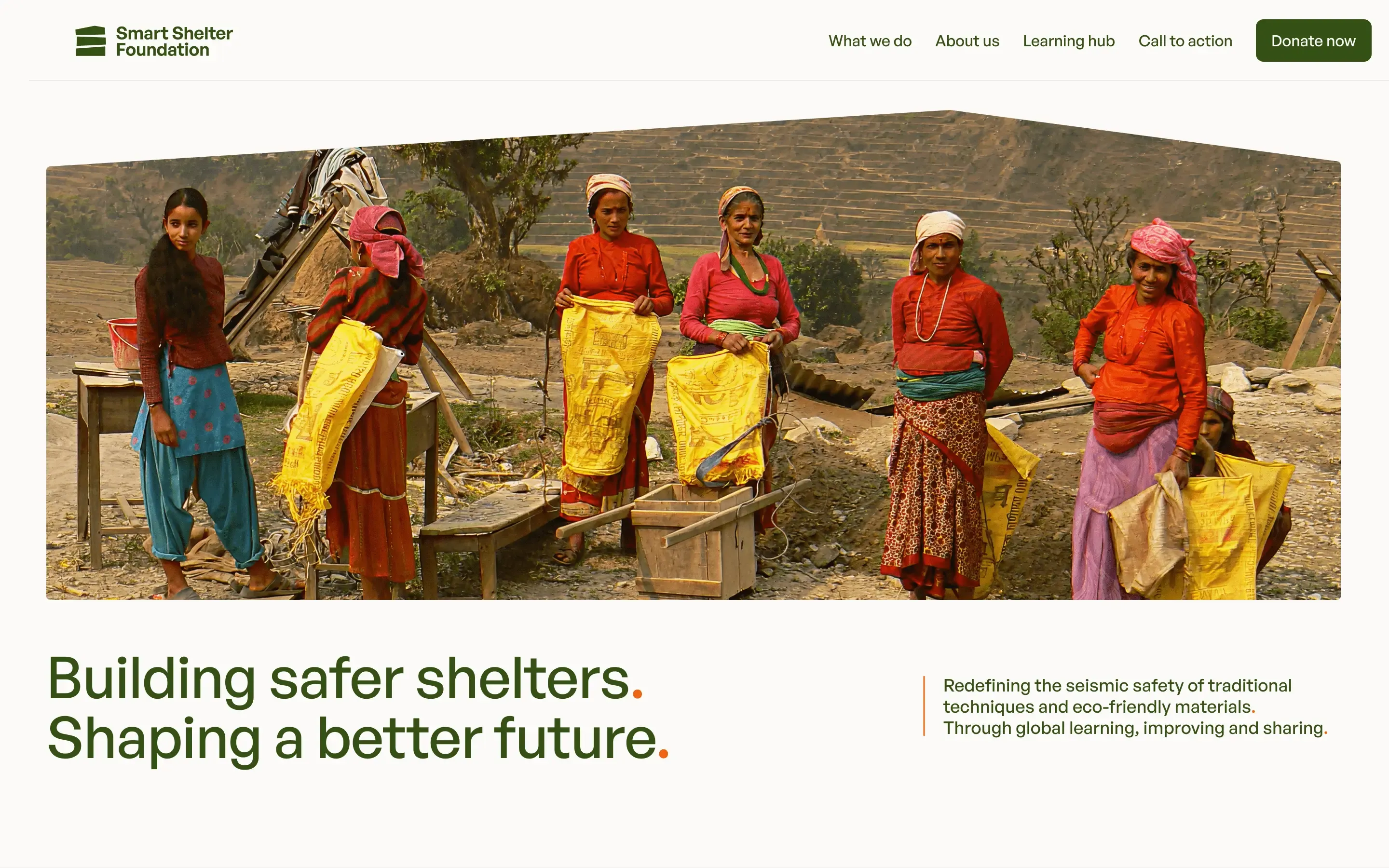
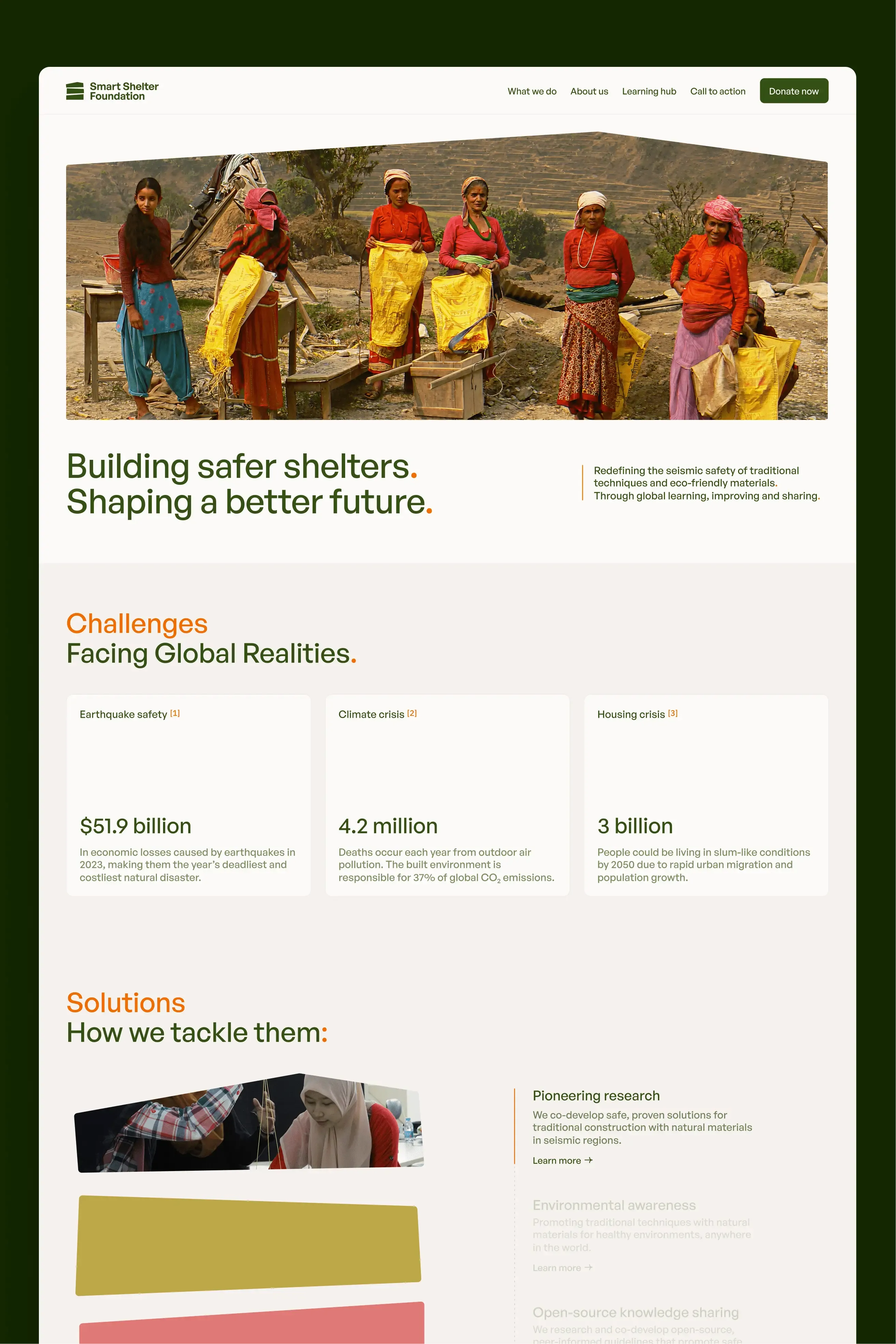
Smart Shelter Foundation transforms complex seismic engineering research into practical, open-source knowledge that empowers communities to build earthquake-resilient homes. When the 2015 Nepal earthquakes struck, the 15 schools they'd helped design remained standing whilst others crumbled. That's the tangible impact of accessible knowledge.
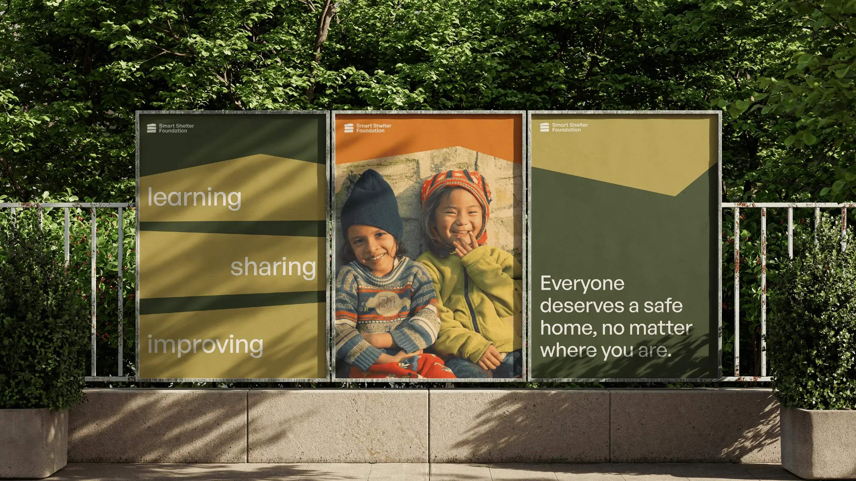
Learning. Improving. Sharing.
Smart Shelter Foundation had 20 years of proven impact but a brand and website that didn't reflect their credibility or evolving mission.

Rebuilding a brand.
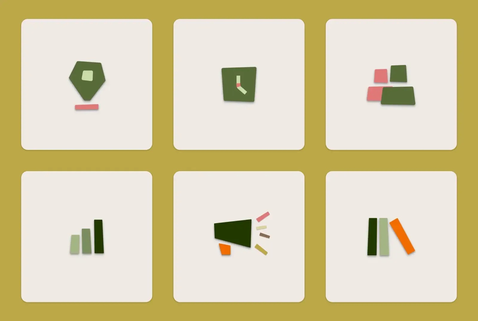
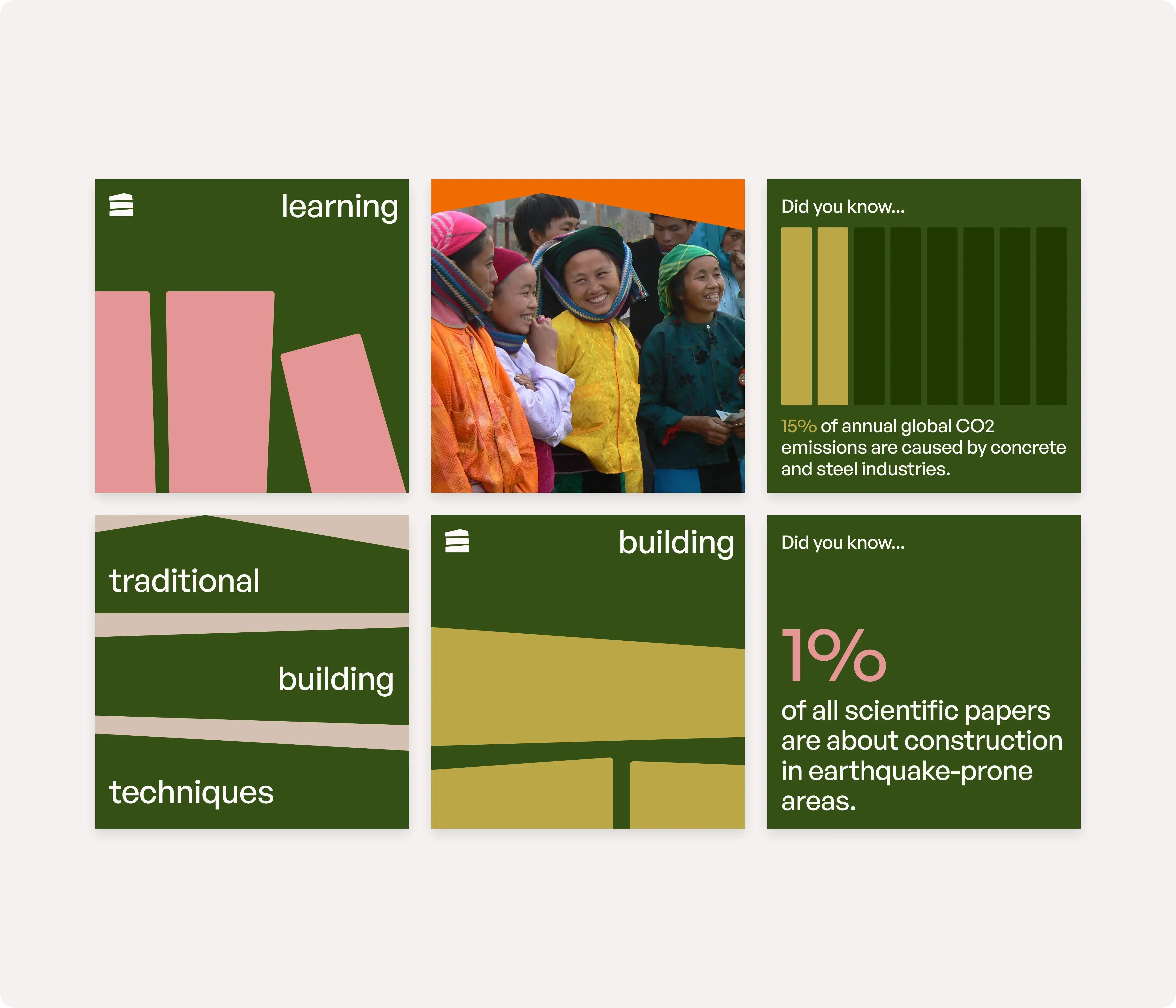
SSF is built on three pillars: learning, improving, and sharing. We used these as the foundation for their new brand identity. The original logo included a hammer alongside the house symbol. We stripped it back, keeping only the house and reimagining it as a grid of bricks, representing both the building materials they research and the modular knowledge they share.
The brand system needed to work across everything from academic publications to social media, maintaining credibility whilst feeling approachable.
The icon system extends the brand's building block concept, giving SSF flexible assets they can use across publications, social media, and presentations.
The colour palette guides different audiences through different topic clusters, adding a touch of warmth.
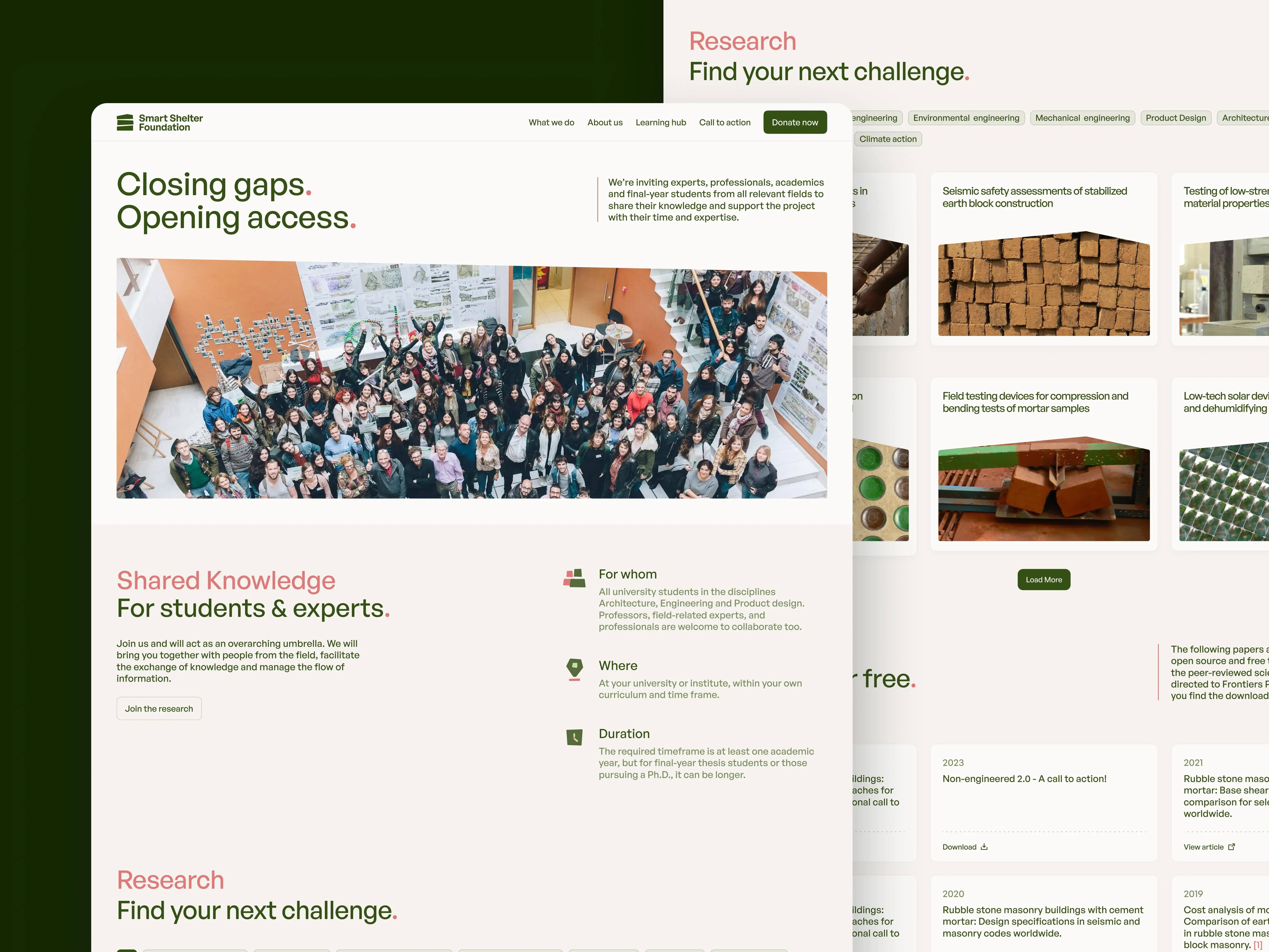
Building a digital home.
SSF needed their website to speak to fundamentally different audiences: students seeking workshop opportunities, academic researchers looking for credible publications, builders needing practical guidance, and donors wanting to understand impact. The challenge was creating distinct pathways for each without fragmenting the experience.
“Thank you all for helping us reinventing SSF! Complete rebrand, fresh look, no-nonsense texts, clear mission and vision... we are very happy with it!”
Martijn Schildkamp
Founder and Director of SSF
The website needed to feel trustworthy to researchers while staying accessible to students and builders with different technical backgrounds.
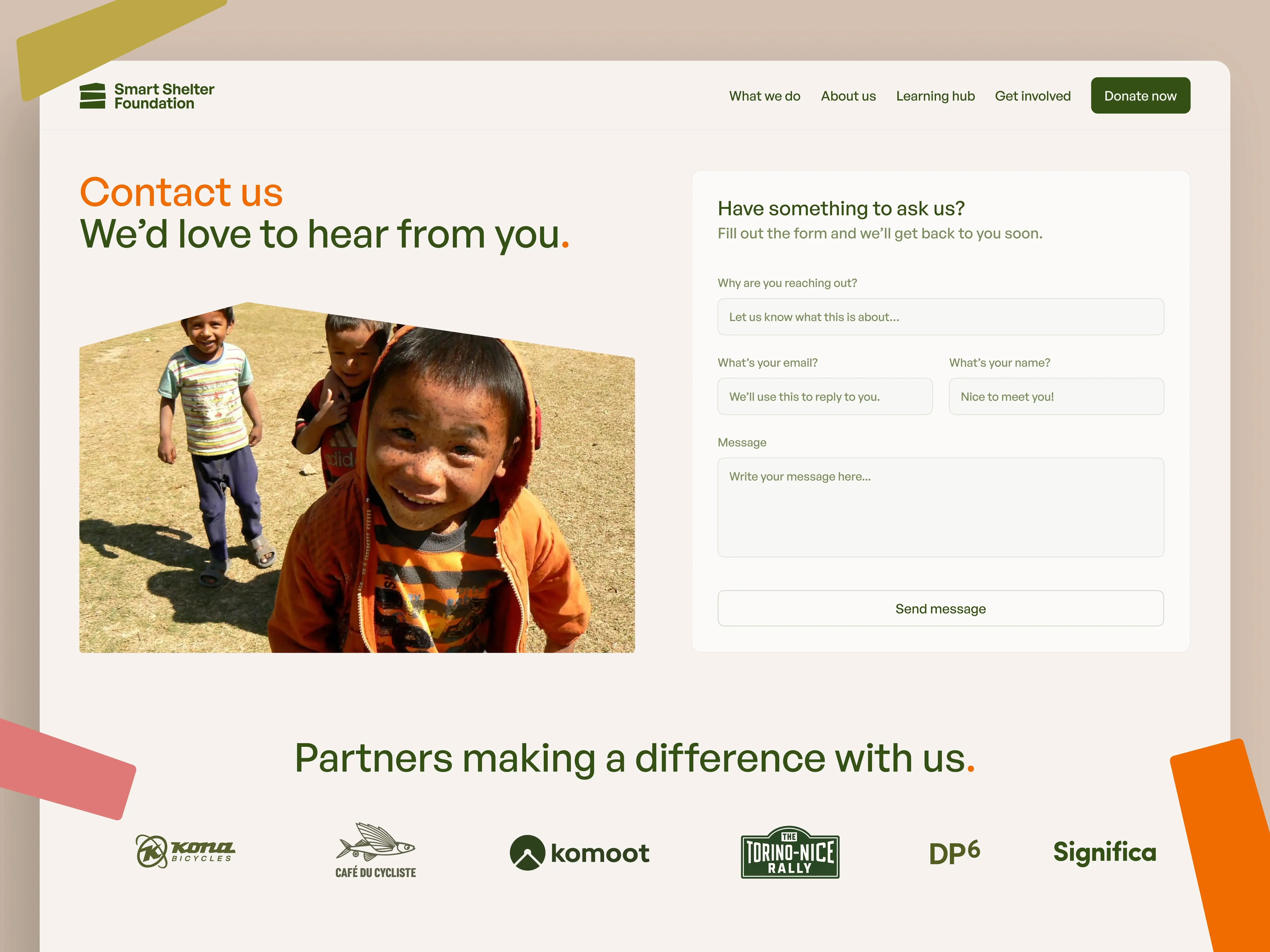
We made it easy for visitors to reach out, whether they're looking to collaborate, donate, or learn more about SSF's work.
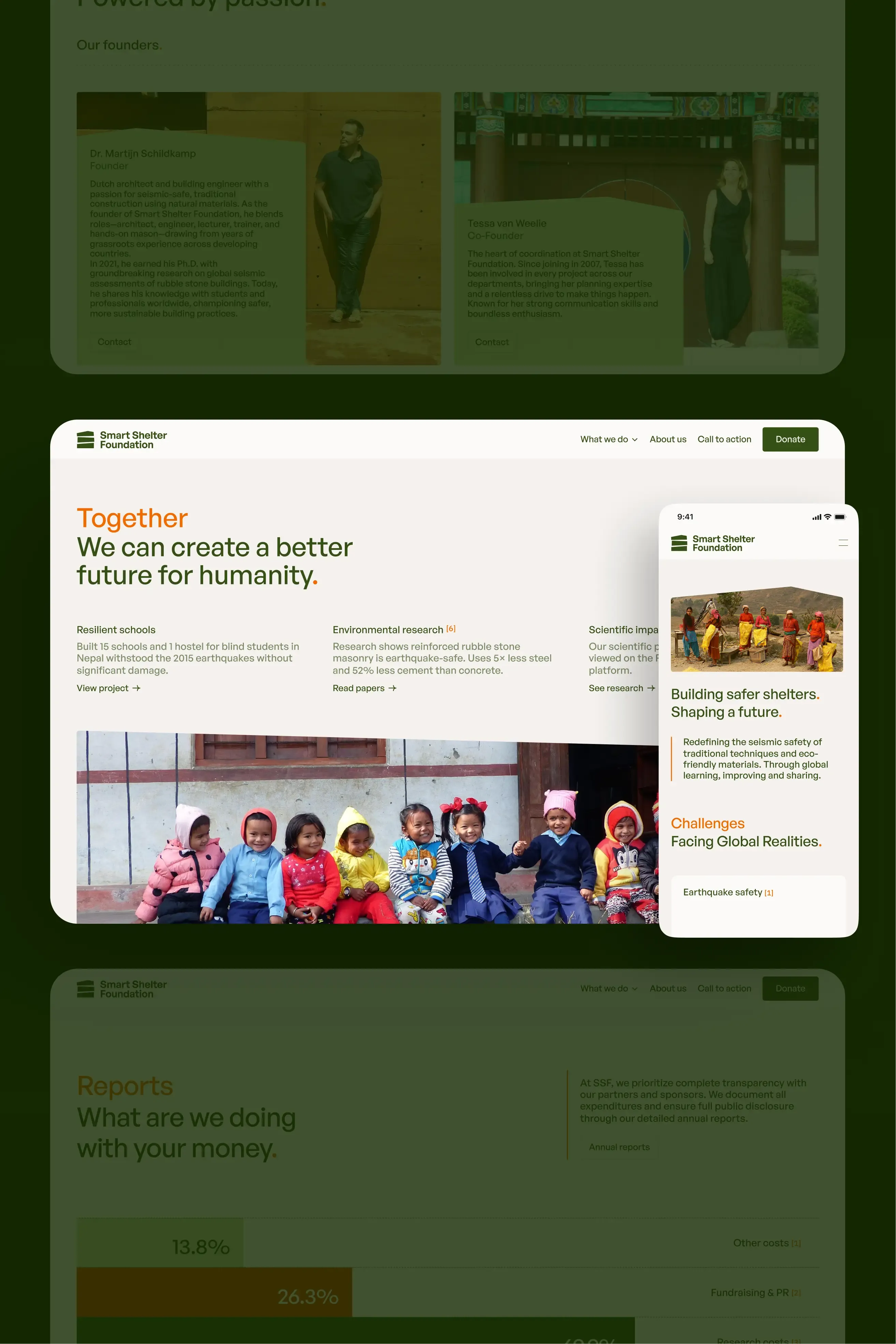
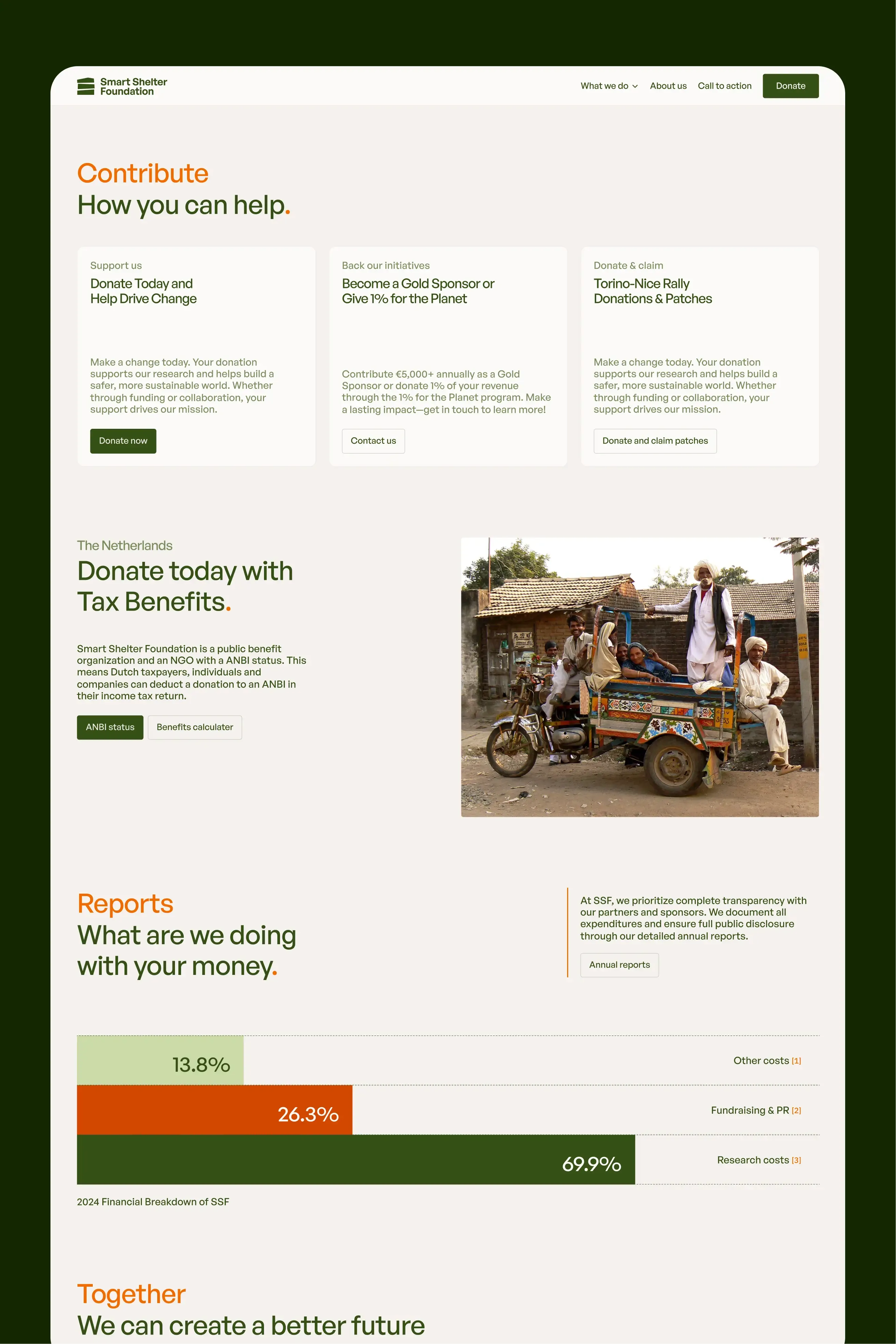
Clear navigation helps each audience find what they need. Students can browse workshops and resources, researchers can access publications, and supporters can see exactly where their donations go.

Partnering with 1% For The Planet.
We commit 1% of our revenue to environmental causes that align with our values. Learn more about our partnership and the organisations we support.
What we’ve learned.
This partnership taught us that the best design work comes from genuine listening. SSF knew their audience intimately: they understood what their community needed in ways we couldn't immediately see. Our job wasn't to impose bold creative ideas, but to translate their deep knowledge into a digital presence that serves their mission. And sometimes the best design decision is restraint. This project didn't need to push creative boundaries to succeed. It needed clarity, credibility, and respect for the community it serves.
When SSF launched and opened workshop applications, over 100 people applied in the first few days, far more than they'd ever seen, proving the success of our partnership. Their website now gives them credibility that matches their purpose, pathways for different audiences, and a platform they can edit independently.
Most importantly, they have a digital home that does what it needs to: makes life-saving knowledge accessible to everyone who needs it.
Significa
Team
Think, Design, Develop, Launch. Write. Repeat. Enjoy our collective musings coming from across our product, design and development teams, all in a neat blog post for you.
We build and launch functional digital products.
Related articles
André Furtado
Creative Director
27 May 2026
•
5 min read
Significa
Team
8 May 2026
•
4 min read
Ana Fernandes
Brand Manager