14 Nov 2025
•
13 min read
Component Composition: Preventing architectural decay.
A simple component starts with three props and, six months later, it has fifty-seven. Here's how to recognise the moment when "just one more feature" becomes technical debt.

"One more prop won't hurt." "This edge case is special." "The PM promised it's the last feature request." You've heard it before. Maybe you've said it yourself. And suddenly, your elegant Button component has 43 props, and nobody dares to touch it.
This is the broken window theory in action. The Pragmatic Programmer uses a powerful metaphor: a building with one broken window sends a signal that nobody cares about maintenance. That single broken window invites more damage. Before long, multiple windows are shattered, graffiti appears, and the building falls into disrepair. The initial neglect creates permission for further decay.

The Pragmatic Programmer
Originally published in October 1999, it is a must-read book for programmers and people managing programmers.
Component design works the same way. That first "just this once" signals to every developer who touches the code afterwards that compromise is acceptable. It becomes the pattern everyone follows, and each subsequent addition feels justified because the precedent has already been set.
At Significa, we've learned to recognise these inflection points: the precise moments when a component transitions from healthy to compromised. Miss that moment, and you're stuck with architectural debt that compounds with every sprint.
This article explores how to identify these critical moments and what to do about them, using real patterns we've refined across projects.
The anatomy of decay: A week-by-week breakdown
Let's trace how a simple component evolves into an unmaintainable mess. We'll use a dashboard project as our case study, watching a StatsCard component decay in real-time.
Week 1: The innocent beginning.
The requirement is straightforward: display a card with statistics in a dashboard.
interface StatsCardProps {
  title: string
  value: number
  icon: ReactNode
}

function StatsCard({ title, value, icon }: StatsCardProps) {
  return (
    <div className="card">
      <div className="icon">{icon}</div>
      <h3>{title}</h3>
      <p className="value">{value}</p>
    </div>
  )
}<StatsCard
title="Revenue"
value={45000}
icon={<DollarSign />}
/>Everything looks good. The component has a single responsibility, no layout complexity, and limited well-defined variants. It's unlikely to need structural changes.
Week 3: The first sign of trouble.
"Can we show trends?"
This seems reasonable. You add trend visualisation:
interface StatsCardProps {
  title: string
  value: number
  icon: ReactNode
  trend?: {
    value: number
    direction: 'up' | 'down'
  }
}

function StatsCard({ title, value, icon, trend }: StatsCardProps) {
  return (
    <div className="card">
      <div className="icon">{icon}</div>
      <h3>{title}</h3>
      <p className="value">{value}</p>
      {trend && (
        <div className="trend">
          <TrendIcon direction={trend.direction} />
          {trend.value}%
        </div>
      )}
    </div>
  )
}
This is still acceptable, but you're seeing the first signs of trouble. Ask yourself:
Is "trend" a core concern of this component?
Could trend visualisation be needed elsewhere?
Are we starting to infer layout decisions from props?
This is the moment to pause and reconsider your approach. Meet your inflection point.
The component now owns the decision that trends appear below the value. What happens when a designer wants a compact version with the trend next to the title? You'll be tempted to add a trendPosition prop, trying to predict every layout possibility.
Week 5: Crossing the threshold.
The PM returns: "Some stakeholders want to see comparisons instead of trends. Oh, and some cards need action buttons. Should be quick, right?"
interface StatsCardProps {
  title: string
  value: number
  icon: ReactNode
  trend?: {
    value: number
    direction: 'up' | 'down'
  }
  comparison?: {
    label: string
    value: number
  }
  action?: {
    label: string
    onClick: () => void
  }
  loading?: boolean
}
function StatsCard({
title,
value,
icon,
trend,
comparison,
action,
loading
}: StatsCardProps) {
return (
<div className="card">
{loading && <Spinner />}
<div className="icon">{icon}</div>
<h3>{title}</h3>
<p className="value">{value}</p>
{trend && (
<div className="trend">
<TrendIcon direction={trend.direction} />
{trend.value}%
</div>
)}
{comparison && (
<div className="comparison">
<span>{comparison.label}</span>
<span>{comparison.value}</span>
</div>
)}
{action && (
<button onClick={action.onClick}>
{action.label}
</button>
)}
</div>
)
}The component is now making layout decisions. Adding features requires modifying the component itself. Action button styling and behaviour are locked in. Loading state positioning is hardcoded.
You could use TypeScript union types to enforce that only trend or comparison can be used, never both. But that requires TypeScript wizardry, and the complexity multiplies with each new feature.
Week 8: The point of no return.
Designers need custom number formatting. The PM overhears and adds: "It should react to locale!" Then tooltips on titles. And badges on top cards.
interface StatsCardProps {
  title: string
  value: number
  icon: ReactNode
  trend?: { value: number; direction: 'up' | 'down' }
  comparison?: { label: string; value: number }
  action?: { label: string; onClick: () => void; variant?: 'primary' | 'secondary' }
  loading?: boolean
  valueFormatter?: (value: number) => string
  tooltip?: string
  badge?: { text: string; variant: 'success' | 'warning' | 'error' }
  titleIcon?: ReactNode
  showBorder?: boolean
  elevation?: 'none' | 'sm' | 'md' | 'lg'
}
You now have 15+ props and are growing. The maintainer needs to understand every possible combination. New features require component surgery, drilling into 500+ lines and trying not to break existing functionality. TypeScript types demand wizard-level expertise, or you lose type safety entirely.
In code review, someone asks: "Why does this component have 57 optional props?"
Where did it go wrong?
Looking back at this decay, when should we have stopped and changed course?
Week 1 was clean. Three props, single responsibility, no problems.
Week 3 showed the first cracks. Adding trend As a nested object meant the component now decided where trends appear. The questions we asked ourselves revealed the issue: "Could trend visualisation be needed elsewhere?" The answer was yes, but we pushed forward anyway.
Week 5 was the turning point. Multiple optional features, mutually exclusive props, and every new requirement meant rewriting the component. This was the moment to stop. Every feature now requires component surgery instead of simple composition.
By Week 8, the damage was done.
The pattern is that the inflection point appears when you add that third optional object prop, or when props start controlling positioning and layout. That's when you pause and ask: "Should this be a composition?"

How we build software.
At Significa, we write simple software, which often requires more consideration and specification than complexity.
The Compositional alternative: rewinding to week 1.
What if we'd caught the inflection point at Week 3 and pivoted? Here's how those same requirements would have played out.
The goal isn't predicting every future requirement. It's building components that don't need modification when requirements change.
Minimal surface area.
Here's the refactored approach using composition:
function StatsCardRoot({ asChild, children, className }: {
  asChild?: boolean
  children: ReactNode
  className?: string
}) {
  const Comp = asChild ? Slot : 'div'
  return <Comp className={cn('card', className)}>{children}</Comp>
}

function StatsCardIcon({ children }: { children: ReactNode }) {
  return <div className="card-icon">{children}</div>
}

function StatsCardTitle({ children }: { children: ReactNode }) {
  return <h3 className="card-title">{children}</h3>
}

function StatsCardValue({ children }: { children: ReactNode }) {
  return <div className="card-value">{children}</div>
}

function StatsCardMeta({ children }: { children: ReactNode }) {
  return <div className="card-meta">{children}</div>
}

function StatsCardFooter({ children }: { children: ReactNode }) {
  return <div className="card-footer">{children}</div>
}

const StatsCard = Object.assign(StatsCardRoot, {
  Icon: StatsCardIcon,
  Title: StatsCardTitle,
  Value: StatsCardValue,
  Meta: StatsCardMeta,
  Footer: StatsCardFooter,
})
Week 1 with composition.
<StatsCard>
  <StatsCard.Icon>
    <DollarSign />
  </StatsCard.Icon>
  <StatsCard.Title>Revenue</StatsCard.Title>
  <StatsCard.Value>$45,000</StatsCard.Value>
</StatsCard>
Week 3 with composition.
<StatsCard>
  <StatsCard.Icon>
    <DollarSign />
  </StatsCard.Icon>
  <StatsCard.Title>Revenue</StatsCard.Title>
  <StatsCard.Value>$45,000</StatsCard.Value>
  <StatsCard.Meta>
    <Trend direction="up" value={12} />
  </StatsCard.Meta>
</StatsCard>
Week 8+ with composition.
<StatsCard>
  <StatsCard.Icon>
    <DollarSign />
    <Badge variant="success">Live</Badge>
  </StatsCard.Icon>
  <StatsCard.Title>
    <Tooltip content="Last 30 days">
      Revenue <InfoIcon />
    </Tooltip>
  </StatsCard.Title>
  <StatsCard.Value>
    {formatCurrency(revenue)}
  </StatsCard.Value>
  <StatsCard.Meta>
    <Trend direction="up" value={12} />
    <Separator orientation="vertical" />
    <span className="text-muted">
      vs {formatCurrency(lastMonth)}
    </span>
  </StatsCard.Meta>
  <StatsCard.Footer>
    <Button variant="ghost" size="sm" onClick={handleViewDetails}>
      View details
    </Button>
    <Button variant="ghost" size="sm" asChild>
      <a href="/export" download>Export</a>
    </Button>
  </StatsCard.Footer>
</StatsCard>
Every new requirement was handled by the composition of existing primitives, not by modifying StatsCard.
How composition handled each week.
Here’s what changed:
Week 1: Instead of a monolithic component, we built primitive subcomponents (Icon, Title, Value). Each does one thing.
Week 3: Trends? No changes to StatsCard. We composed a <Trend> inside <StatsCard.Meta>. Done.
Week 5: Comparisons and action buttons? Still no changes. Different composition, same primitives.
Week 8: Tooltips, badges, locale formatting, custom layouts. Zero component surgery. Everything is handled through composition.
<StatsCard>
  <div className="flex items-start justify-between">
    <div>
      <Tooltip content="Users that logged in at least once">
        <StatsCard.Title>Active Users</StatsCard.Title>
      </Tooltip>
      <StatsCard.Value>1,234</StatsCard.Value>
    </div>
    <SparklineChart data={dailyUsers} />
  </div>
  <Progress value={75} />
</StatsCard>
This approach delivers significant advantages. Most components maintain a minimal surface area, accepting just children and className. Their size stays stable because they don't grow with new features. Each component keeps a single responsibility, doing one thing well. There's zero configuration to manage, no conditional logic, just semantic HTML structure. The blocks are fully composable, letting you mix and match or add your own components in between.
The complexity moved from implementation to usage, and that's exactly where it should be. The developer knows their specific needs better than the component author could predict.
When coordination is needed: Context API.
Sometimes subcomponents need to coordinate without prop drilling. Imagine a scenario where child components need to adapt their behaviour based on configuration or state from their parent. You could pass props down through every level, but that becomes tedious and cluttered. This is where React Context comes in. It allows subcomponents to access shared data from a parent without explicitly passing props through each intermediate layer, letting them react accordingly to the parent's state or configuration.
Consider a MediaCard component where the cover image needs to adapt based on the card's format:
const MediaCardContext = createContext<{
  format: MediaFormat
} | null>(null)

function MediaCardRoot({ format, children }: MediaCardProps) {
  const context = useMemo(() => ({ format }), [format])

  return (
    <MediaCardContext.Provider value={context}>
      <div className="media-card">{children}</div>
    </MediaCardContext.Provider>
  )
}

function MediaCardCover({ children }: { children: ReactNode }) {
  const { format } = useMediaCardContext()

  return (
    <div
      className={cn(
        'cover',
        format === 'portrait' && 'aspect-[3/4]',
        format === 'landscape' && 'aspect-[4/3]'
      )}
    >
      {children}
    </div>
  )
}
When to use Context API.
Context works well when subcomponents need to adapt based on their parent's state or configuration. It's particularly useful for avoiding the tedious duplication of props across every child component, especially when that state is truly internal and not something the end user should manage directly.
That said, if your components work perfectly fine independently, or if only a single child needs access to specific data, simple prop passing is cleaner and more explicit. Save context for scenarios where the coordination between parent and children genuinely justifies the additional abstraction.
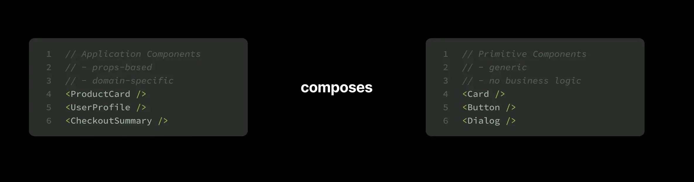
The best of both worlds: Componentisation.
Composition gives you flexibility. But sometimes you want convenience. The solution? Build both layers.
The primitive layer.
Low-level design system components that rarely change:
// Primitives with composition
<Card>
  <Card.Image>
    <img src={product.image} alt={product.name} />
    {product.discount && <Badge>{product.discount}%</Badge>}
  </Card.Image>
  <Card.Title>{product.name}</Card.Title>
  <Card.Price>
    <span className="text-lg font-bold">${product.price}</span>
    {product.originalPrice && (
      <span className="line-through text-muted">
        ${product.originalPrice}
      </span>
    )}
  </Card.Price>
  <Card.Footer>
    <Button onClick={() => addToCart(product)}>
      Add to Cart
    </Button>
  </Card.Footer>
</Card>
The component layer.
High-level, app-specific patterns that compose primitives:
interface ProductCardProps {
  product: Product
  onAddToCart: (product: Product) => void
}

function ProductCard({ product, onAddToCart }: ProductCardProps) {
  return (
    <Card>
      <Card.Image>
        <img src={product.image} alt={product.name} />
        {product.discount && <Badge>{product.discount}%</Badge>}
      </Card.Image>
      <Card.Title>{product.name}</Card.Title>
      <Card.Price>
        <span className="text-lg font-bold">${product.price}</span>
        {product.originalPrice && (
          <span className="line-through text-muted">
            ${product.originalPrice}
          </span>
        )}
      </Card.Price>
      <Card.Footer>
        <Button onClick={() => onAddToCart(product)}>
          Add to Cart
        </Button>
      </Card.Footer>
    </Card>
  )
}
Now across three different pages:
// In ProductGrid.tsx
<ProductCard product={product} onAddToCart={addToCart} />

// In FeaturedProducts.tsx
<ProductCard product={product} onAddToCart={addToCart} />

// In SearchResults.tsx
<ProductCard product={product} onAddToCart={addToCart} />
Clean code with no repetition. The design stays consistent, and changes apply everywhere at once.
Key principle: Use primitives for low-level design system components. Use prop-based wrappers for high-level, app-specific patterns.
When to create prop-based wrappers.
The decision to create a prop-based wrapper comes down to repetition and domain specificity. If you find yourself writing the same markup three or more times, that's a signal. Similarly, if the pattern is specific to your business domain rather than a generic UI concern, a wrapper makes sense. These components are also valuable when you want to enforce consistency across your application or reduce the cognitive load for team members who shouldn't need to think about implementation details.
Resist the urge to componentise patterns that only appear once or twice. Inline code is fine! If the pattern varies significantly between use cases, you'll end up with either multiple similar components or one overly complex component trying to handle every variation. And sometimes, if your copy-paste game is strong and the pattern is simple enough, that's perfectly acceptable.
Recognising early warning signs.
The key to preventing decay is catching it early. Components rarely become unmaintainable overnight; they signal their distress long before they collapse.
Props.
Start paying attention to your props. When you see props accepting objects with multiple nested properties (like showAction: { label, onClick, icon, variant }), that's often the first red flag. Props that are mutually exclusive (you can have showTrend or showComparison, but never both) suggest your component is trying to be too many things. Watch out for props that start with "render", "custom", or "also"… names like renderFooter, customHeader, or alsoShowBadge betray an interface that's been bolted onto rather than designed. Any prop that controls positioning (like actionPlacement: 'header' | 'footer') means your component is making layout decisions it probably shouldn't own.
// Props that take objects with multiple properties
showAction?: {
  label: string
  onClick: () => void
  icon?: ReactNode
  variant?: string
}

// Props that are mutually exclusive
showTrend?: boolean
showComparison?: boolean

// Props that start with "render" or "custom"
renderFooter?: () => ReactNode
customHeader?: ReactNode
More props.
// Props that control positioning
iconPosition?: 'left' | 'right' | 'top'
actionPlacement?: 'header' | 'footer'

// Props with names like "also", "additionally"
alsoShowBadge?: boolean
additionalContent?: ReactNode
Component markup.
The component's internal markup tells its own story. Excessive branching logic based on props, especially when you're directly mapping props to children, indicates the component is doing too much coordination work. When conditionals nest several levels deep just to render the right combination of elements, you're likely past the point where a single component makes sense.
// Excessive branching based on props
if (variant === 'compact') {
  if (showAction) {
    return <CompactWithAction />
  }
  return <Compact />
}

// Mapping props to children
{showIcon && icon}
{showBadge && badge}
Look at how the component fits into your broader architecture. If multiple developers have recently "enhanced" the same component, it's becoming a bottleneck. When pull requests touching the component require extensive review because nobody's confident about side effects, that's a problem. Component files that exceed 300 lines are usually trying to do too much. And if a component has developed its own state management infrastructure just to handle layout decisions, it's taken on responsibilities that should live elsewhere.
When you see these signs: stop. Refactor. The cost of refactoring now is a fraction of what you'll pay later.
Comments.
// TODO: This is getting messy
// FIXME: Special case for mobile
// Don't modify without checking /routes/page-y.tsx
// Sorry
An honest documentation of technical debt. You've probably seen them: "TODO: This is getting messy", "FIXME: Special case for mobile", "Don't modify without checking /routes/page-y.tsx", or the apologetic "Sorry." These comments are distress signals from developers who recognised something was wrong but didn't have time to fix it.
Tackling technical debt.
Preventive work, feature prioritisation and other useful tips from our CPO, Tiago Duarte.
Questions to ask before adding a prop.
When a feature request lands and you're tempted to add another prop, pause. Run through these questions:
Does this control where something appears? If yes, that's layout. Layout belongs in composition, not configuration.
Am I limiting how consumers structure content? Props that dictate structure (like iconPosition or actionPlacement) prevent users from creating layouts you didn't anticipate.
Would different designs need different values? If your prop works for one design but constrains another, you're encoding visual decisions that should live in consumer code.
Is this really the component's responsibility? Sometimes what looks like a component prop is actually the parent's concern. A showLoadingSpinner prop might be better handled by the parent rendering a spinner as a child.
Could this be achieved by rendering children? Before adding customFooter or renderHeader props, ask if you could just accept children and let consumers compose the layout themselves.
If the answer to any of these is "yes", composition is likely the better approach.
Design principles for well-composed components.
Good component design comes down to a few core principles that we've refined through experience.
Trust the consumer.
Instead of building components that try to predict every possible use case through configuration props, give developers the building blocks and trust them to compose solutions. A Dialog that accepts children and manages behaviour (focus, escape key, backdrop) is more flexible than one that dictates where buttons should appear in its footer.
✅ "Here's a container and semantic pieces, go crazy"
❌ "I've predicted every use case, configure via props"
Provide behaviour instead of layout.
Components should manage the things users can't easily implement themselves: focus management, keyboard interactions, accessibility concerns. But they shouldn't dictate visual layout or the specific arrangement of their children. A Dialog managing focus and escape key handling is providing value. A Dialog deciding that action buttons must always appear right-aligned is being prescriptive about concerns that should live in the consuming code.
✅ <MediaCard.CoverControl position="top-right">
❌ <MediaCard closeButtonPosition="top-right">
Offer extension points, not configuration.
Instead of adding props for every possible variation, create composable slots where developers can insert their own components. This is the difference between a closeButtonPosition prop and a CoverControl component that accepts a position and renders whatever children you pass it.
The extension point approach scales naturally. Need a badge instead of a close button? A custom icon? Multiple controls? The component doesn't need to change, you just compose differently.
✅ Dialog manages focus, escape key, backdrop
❌ Dialog decides button order in footer
Now, let's see these principles in action. Here's a real example of recognising when a component needs refactoring:
Analysing.
interface SearchBarProps {
  placeholder: string                               // ✅ Intrinsic behavior
  value: string                                     // ✅ Intrinsic behavior
  onChange: (v: string) => void                     // ✅ Intrinsic behavior
  showClearButton: boolean                          // ❌ Should be composition
  showSearchIcon: boolean                           // ❌ Should be composition
  loading: boolean                                  // ❌ Should be composition
  suggestions: string[]                             // 🤔 Separate component?
  onSuggestionClick: (s: string) => void            // ...
  maxSuggestions: number                            // ...
  renderSuggestion: (s: string) => ReactNode        // yep
}
Refactoring.
<SearchBar
  value={query}
  onChange={setQuery}
  placeholder="Search..."
>
  <SearchBar.Icon><SearchIcon /></SearchBar.Icon>
  {query && (
    <SearchBar.Action onClick={() => setQuery('')}>
      <XIcon />
    </SearchBar.Action>
  )}
  {isLoading && <SearchBar.Loader />}
</SearchBar>

{suggestions.length > 0 && (
  <SuggestionsList>
    {suggestions.slice(0, maxResults).map(suggestion => (
      <SuggestionItem
        key={suggestion.id}
        onClick={() => handleSelect(suggestion)}
      >
        {suggestion.title}
      </SuggestionItem>
    ))}
  </SuggestionsList>
)}
These principles guide good composition, but it's worth understanding the trade-offs before committing to this approach.
Trade-offs and when to choose composition.
Composition isn't free. Understanding its costs helps you make informed decisions about when to use it.
The most obvious cost is verbosity. A props-based component that accepts title, value, and icon is concise. The compositional equivalent requires wrapping each piece in its own subcomponent, which means more typing and more lines of code. For simple, stable components, this extra ceremony might not be worth it.
Composition also makes it easier to create nonsensical structures. Props-based components use TypeScript to guide you towards valid configurations: autocomplete shows you the available options, and the compiler prevents invalid combinations. With composition, you can technically nest components in absurd ways, like putting a value before a title or inserting random elements between semantic parts. The component can't prevent this; it trusts you to compose sensibly.
Related to this is the autocomplete experience. Props give you immediate feedback about what's available and what types are expected. Compositional APIs require you to check documentation or dive into source code to understand what subcomponents exist and how they should be used. New team members need time to build that mental model.
The decision ultimately depends on your specific context. Composition excels when building components that will evolve with new features, where flexibility matters more than simplicity. It's essential for design systems and shared libraries serving multiple teams with different needs. But for genuinely stable components with one clear use case, or components dealing with business logic rather than presentation, the added flexibility may not justify the overhead.
Recognise the inflection point. When you add that third optional object prop, it's time to refactor.
Composition isn't always the answer. Simple components with stable APIs don't need it.
Test different scenarios. Can users achieve what they need without modifying the component? If not, your abstraction is wrong.
Prevent the first broken window. Push back on props that encode layout or structure. That first "just this once" becomes the pattern everyone follows.
Trust your judgement. If adding a feature feels like a hack, the architecture is fighting you.
Every prop is a promise. Each one you add is a commitment you're making to maintain forever.
Avoid over-engineering. It's better to write simple code that everyone understands than clever code that only you can maintain.
Bottom line.
Component architecture isn't about rigid rules. It's about developing judgment. The ability to recognise the moment when a simple component starts becoming complex, and having the discipline to refactor before technical debt accumulates.
The patterns we've explored aren't theoretical. We refactored a major project using these principles, and the results were tangible. What once required hours of component surgery now takes minutes of composition. Features that would have meant modifying core components now happen entirely in consumer code. There's a running joke from that project: the backend team would spend weeks building complex features that the frontend would then wire up in 20 minutes. That's what happens when you have the right primitives.
The broken window matters. When you add that first prop encoding layout decisions, you signal that compromising the component's design is acceptable. When you add that object prop with five nested properties, you've shown that predicting use cases through configuration is the pattern to follow. Each subsequent developer will see that precedent and continue it.
Composition is about trust. It's about admitting you can't predict every use case and providing building blocks instead of configuration options. It's more verbose, yes. It has a steeper learning curve, yes. But it's also the difference between a component that serves your needs for two years and one that grows with your application for five.
The question isn't whether your components will need to evolve, it's whether they're designed to evolve gracefully.
Pedro Brandão
Founder and Front-end Developer
Pedro el patron Brandão is the Founder of Significa. Pedro’s playlist is made entirely of songs no one has ever listened to.
We build and launch functional digital products.
Related articles
Significa
Team
8 May 2026
•
4 min read
Julieta Frade
Front-end Developer